Role: UX/UI Designer | Timeline: 6 weeks | Tools: Sketch, InVision, Hotjar
T H E C H A L L E N G E
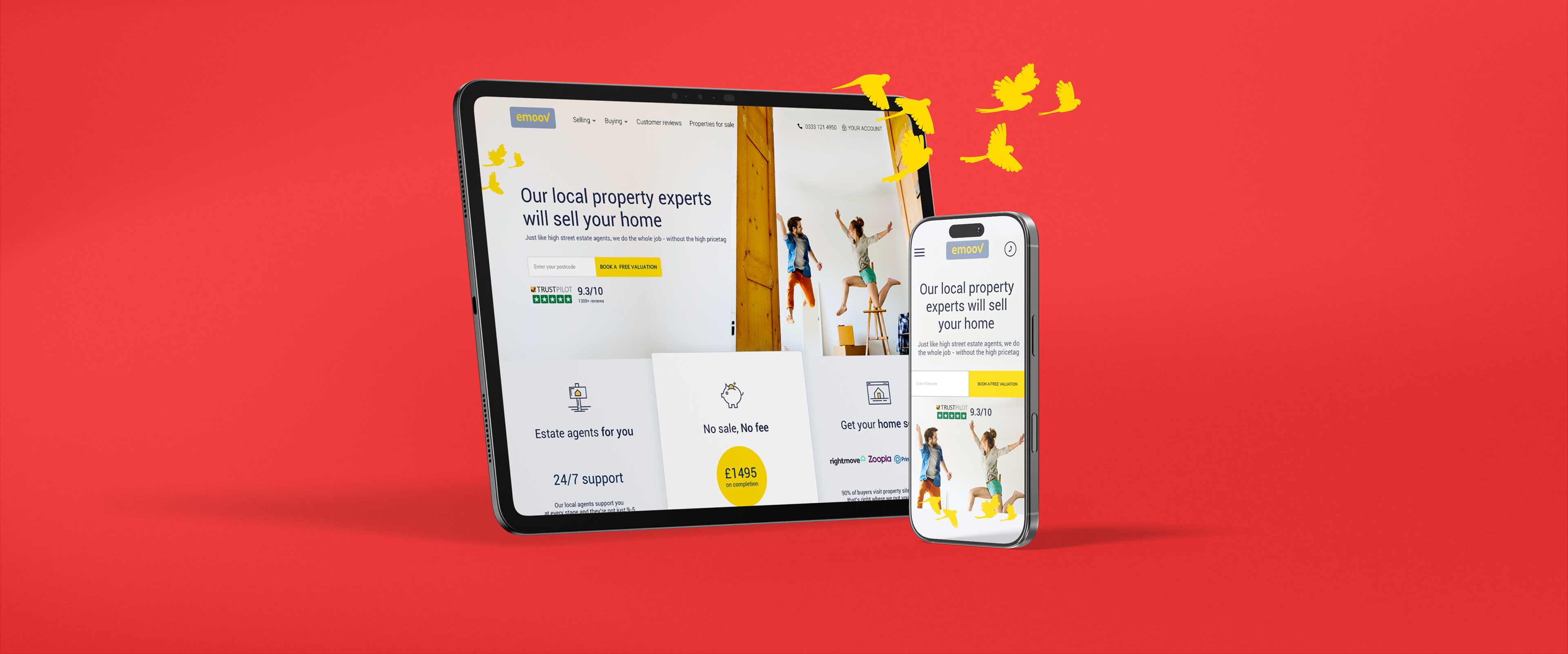
Emoov: Homepage Redesign & Conversion Strategy
The Brief: Redesign Emoov's homepage to reduce cognitive overload, surface key benefits, and improve conversion through strategic information architecture and UI design.
The Problem: High cognitive load, hidden benefits, unclear value proposition. Users couldn't quickly understand what Emoov offered, why they should trust them, or what to do next.
The Goal: Create a conversion-focused hierarchy answering customer questions in the right order, with UI that showcases value at every scroll.

F A I L F A S T
The Problems
Emoov wanted the 'fail fast' approach, moving quickly from insights to build. This meant a quick multi-method research approach was needed to identify why the homepage was failing.
Heatmap & Session Recording Analysis (Hotjar) - Analysed user sessions revealing critical insights:
• 34% of users never scrolled past the hero section
• CTAs were overlooked despite prominent placement
• Dense text blocks were completely ignored
• Users exhibited "scanning fatigue"—rapid scrolling without reading
• Users left not understanding the benefits and not trusting Emoov
Competitive Analysis: Audited 8 competitor homepages, identifying best practices and differentiation opportunities.
The existing homepage had fundamental issues, 7 core failures were identified.
1. Cognitive Overload: Too much tightly packed information made it impossible to digest the key message.
2. No Emotional Connection: Heavy text and lack of imagery led to low engagement.
3. Accessibility Failures: Text over images with weak contrast hurt readability and failed WCAG accessibility standards.
4. Hidden Value Proposition: Core benefits were buried in dense copy. Users had to hunt for reasons to choose Emoov.
5. No Progressive Engagement: Nothing encouraged users to explore below the fold.
6. Trust Gap: Missing reviews, social proof, and credibility markers left users doubtful.
7. Random Information Flow: Information felt scattered with no clear journey guiding users toward a decision.

T h e S t r a t e g y
Question-Driven Architecture
I restructured the homepage around the five critical questions customers ask before converting, informed by my user research and customer service insights.
The Psychology: Users don't explore randomly—they seek answers to specific questions in a predictable order. By anticipating and answering these questions sequentially, we could guide users from curiosity to confidence to conversion.
The Framework:
Section 1: What is Emoov?
• Left-aligned content, right-aligned real world imagery, leveraging user behaviour research showing 80% of desktop attention focuses left side.
• Clean UI with CTAs mimicking logo styling. Fold line teases content below, encouraging scroll without overwhelming above-the-fold space.
Section 2: What can you offer me?
• Component system with clear goals—Benefits, packages, and services presented through custom line icons in brand colours. Each component navigates to detailed pages: How It Works, Packages, Features.
• Strategic information placement making conversion paths obvious and accessible.

Section 3: Can I trust Emoov?
• User-generated social proof—Scrollable customer reviews answering reservations with real experiences. Pulled most informative testimonials addressing common objections.
• Built on research: 80% of consumers trust user reviews as much as personal recommendations.
Section 4: What can I expect?
• Process transparency—High-level service overview with prominent CTAs below. Human imagery supporting decision ease. Simple, scannable layout reducing friction.
Section 5: Why choose Emoov?
• Company credibility—CEO video for users seeking deeper trust signals. • Channel 4 backing providing third-party validation. Transparent company story making the brand relatable.
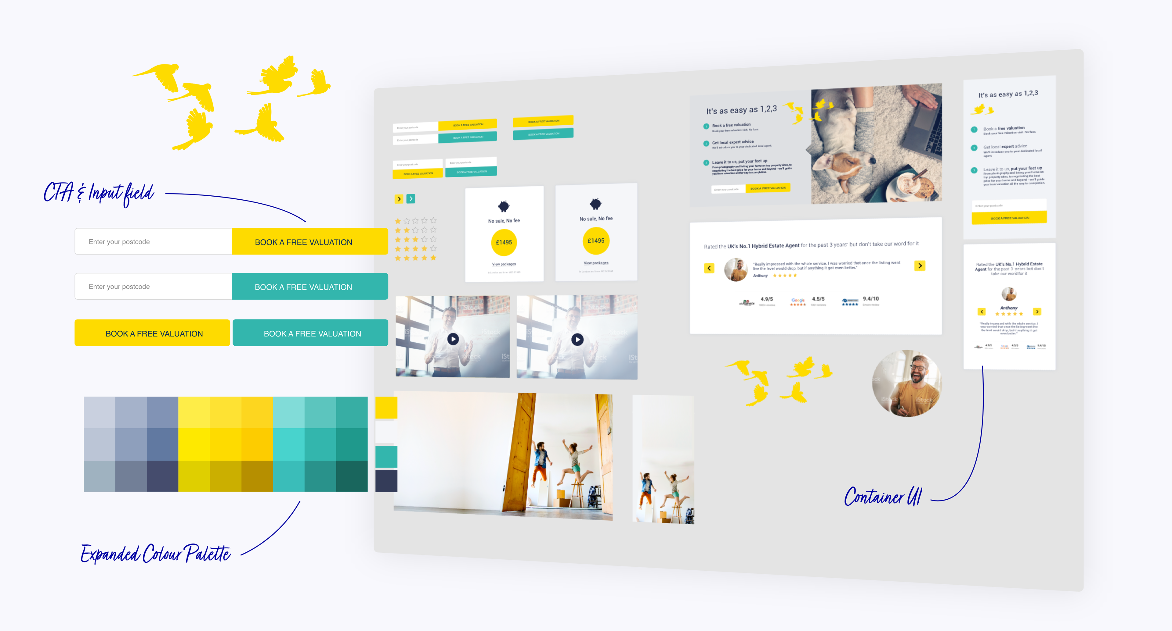
T H E S Y S T E M
The Global UI Library
Alongside the homepage redesign, I initiated a comprehensive design system to support future page development and maintain consistency.
What I Created:
• Centralised Component Library (Sketch)
• Buttons: 6 variations (primary, secondary, outline, disabled states)
• Icons: 24 custom line icons with consistent visual style
• Form Elements: Input fields, dropdowns, checkboxes, radio buttons
• Cards: Testimonial cards, benefit cards, package cards
• Colours: Brand color library with hex codes and usage guidelines
Typography: Text styles with consistent hierarchy (H1-H6, body, captions)
Brand Assets: Logos, illustrations, photography style guidelines
Modular Sections: Pre-built homepage sections adaptable for other pages
The Efficiency Gain: Every future design built from the same components. No inconsistencies, no starting from scratch, just speed. As the library grew, new pages could be assembled in hours instead of days.
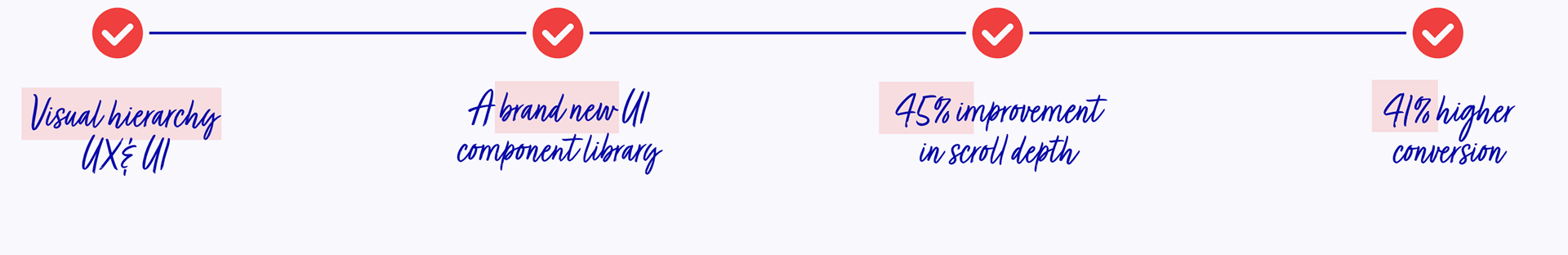
T H E I M P A C T
The Launch
Phased Rollout: Rather than launching to 100% of traffic immediately, I recommended an A/B test approach:
Week 1-2: 20% of traffic to new design
Week 3-4: 50% of traffic (after initial optimisations)
Week 5: 100% rollout
This allowed us to catch issues early and make data-driven refinements before full launch.
Initial Optimisations:
• Adjusted CTA button size (slightly larger based on click data)
• Modified testimonial section to show autoscroll for better social proof visibility
• Refined mobile spacing for better thumb-zone accessibility
.The Impact
User Engagement:
• Bounce rate: 68% → 47%
• Average time on page: 23 seconds → 1 minute 42 seconds
• Scroll depth: 40% → 73%
Conversion Performance:
• Homepage → package pages: 8% → 15.2%
• Homepage → "Get Started" flow: 3.1% → 9.8%
• Mobile conversion rate: 2.4% → 4.9%