Role: Senior Digital Designer | Timeline: 3 months | Tools: Adobe XD, Photoshop, Illustrator
T H E C H A L L E N G E
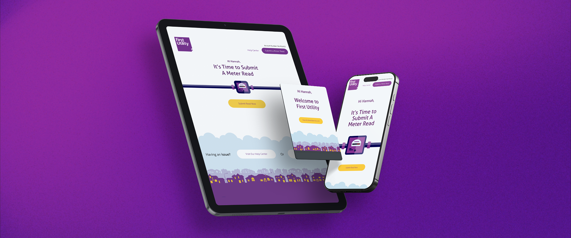
First Utility: Email Design System & Icon Library
The Challenge: First Utility's email communications were inconsistent, cluttered, and difficult to maintain. With multiple email templates across transactional and marketing communications, the team needed a scalable system that improved user experience while reducing design and development time.
The Problem:
• No unified structure across transactional and marketing emails
• Cluttered layouts made content hard to digest
• Inconsistent iconography causing user confusion
• High maintenance burden (updating templates took hours)
• Poor mobile experience (67% of emails opened on mobile)
• No character or personality to match our branding
The Opportunity: Build a comprehensive design system that would serve as the foundation for all email communications, improving clarity, consistency, and team efficiency.
R E S E A R C H
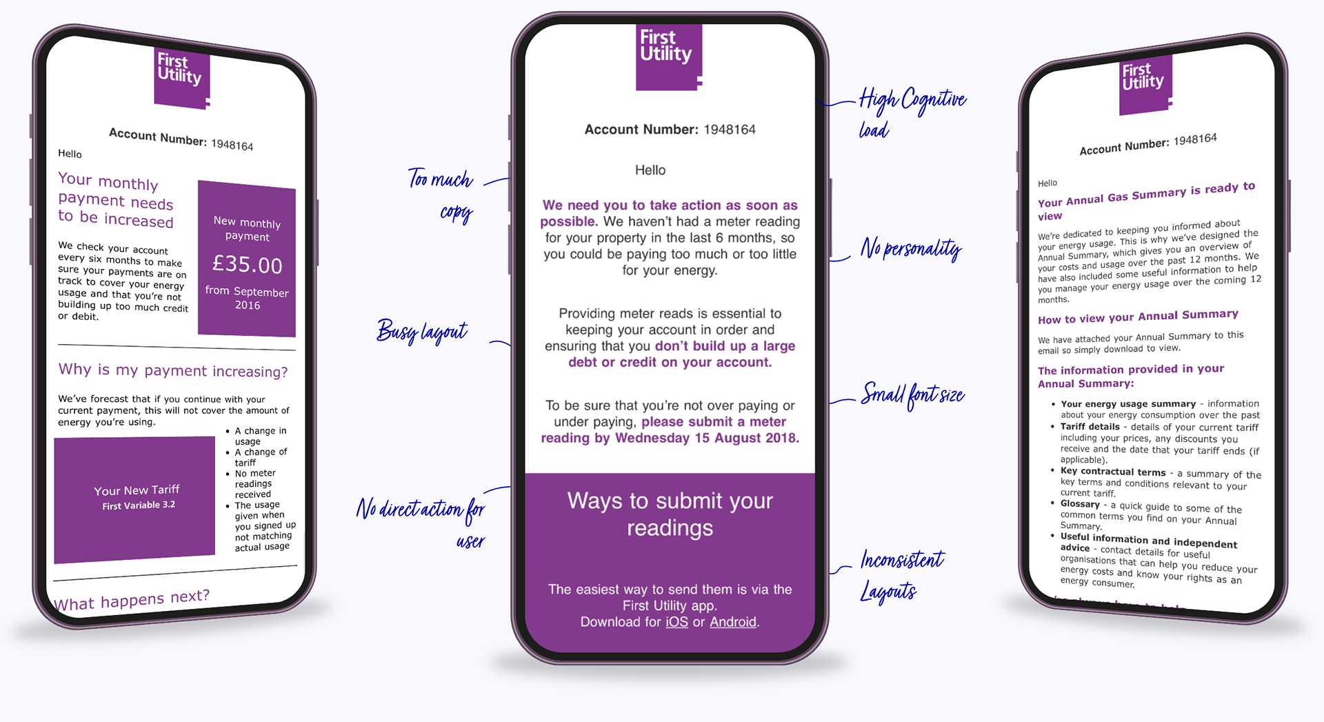
The Discovery
I cataloged every email template in use, identifying:
• Multiple different header styles
• Varies different color applications (many off-brand)
• Inconsistent typography (4 different font hierarchies)
• No uniform icon styles (many visually conflicting)
• No standard component library
User Research: Collaborated with customer service to understand email-related customer complaints:
• "I couldn't find the meter reading instructions"
• "The email was too busy—I gave up"
• "I clicked the wrong link because icons were confusing"
Behavioural Data Analysis: Reviewed email metrics for 6 months:
• Low click-through rates on CTAs (average: 4.2%)
• High deletion rates without reading (34%)
• Below-industry engagement on marketing emails
• Low meter reading submission rates from email prompts
The Insight: Email isn't just communication, it's a critical touchpoint for user actions like meter readings, bill payments, and service updates. Poor email design directly impacted business operations.

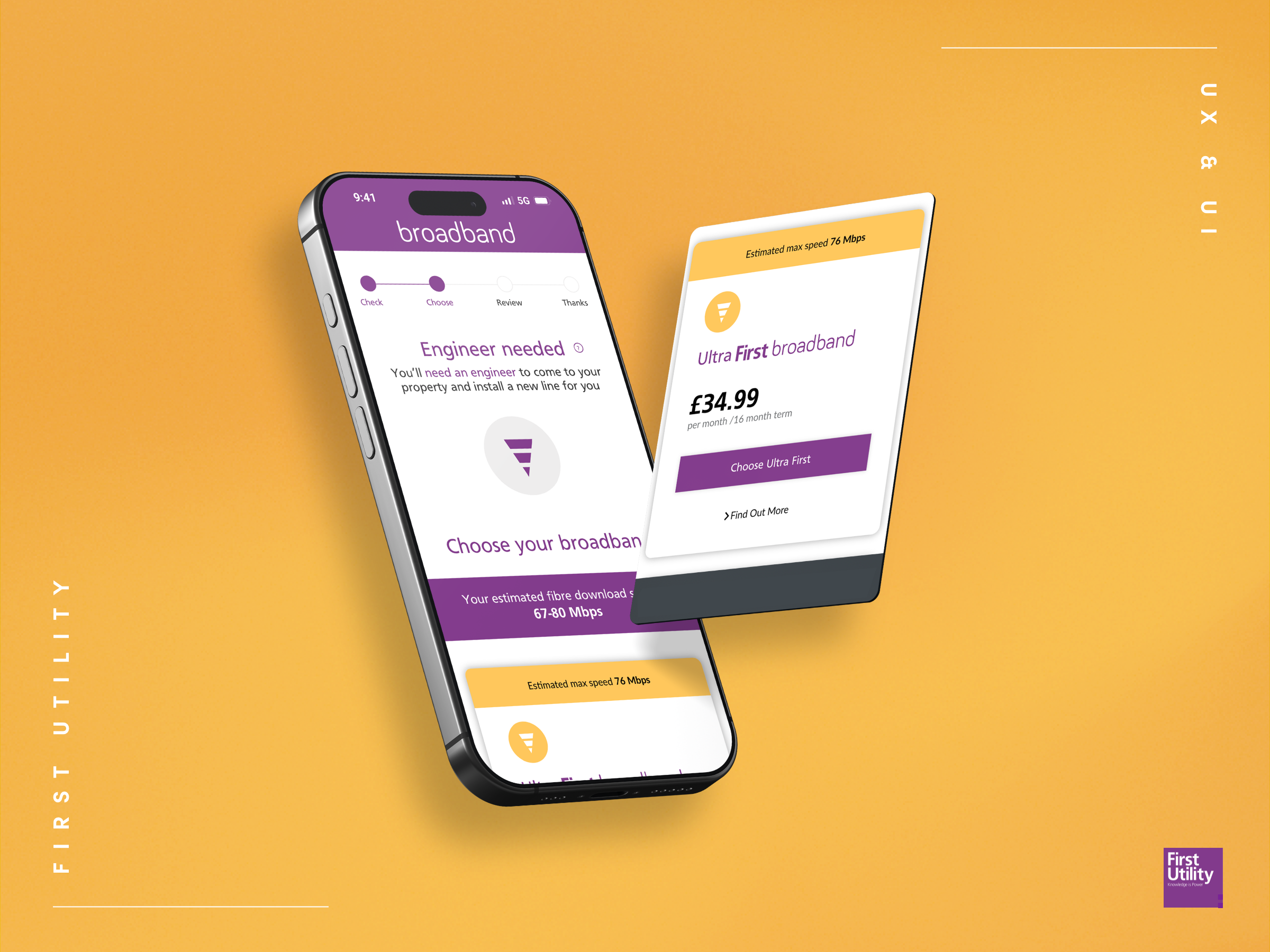
U P D A T E D D E S I G N
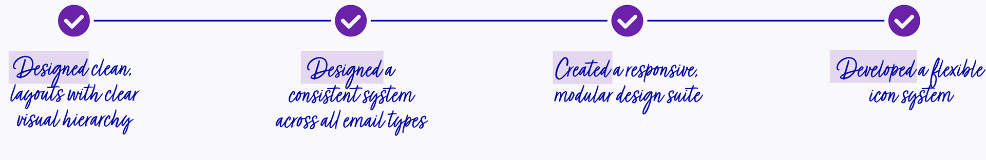
The Redesign
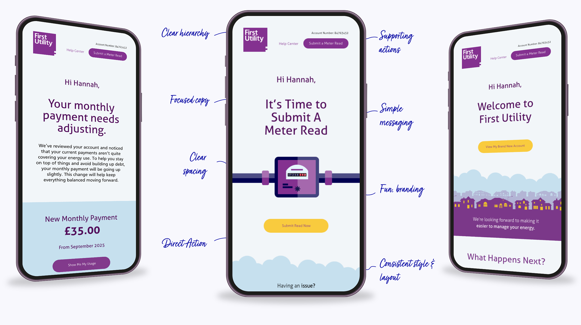
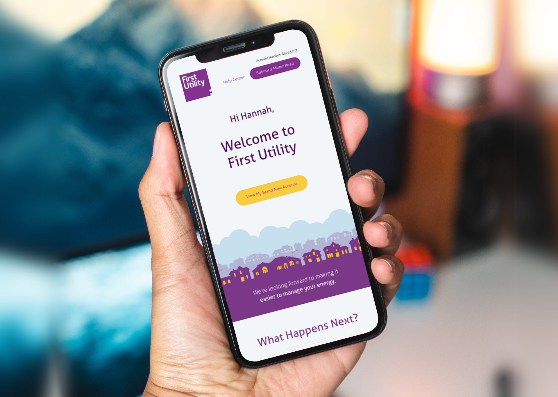
Redesigned the entire email system around clear content hierarchy and user behaviour.
The Approach: Simplified layouts to guide users through key actions without clutter. Brand purple took center stage while secondary colours supported clarity and accessibility, never competing for attention.
The Details That Mattered:
• Standardised placements for Account and Help links—familiar navigation users could rely on
• Clear visual hierarchy reducing cognitive load and minimizing drop-offs
• Flat vector illustration style adding visual interest without overwhelming content
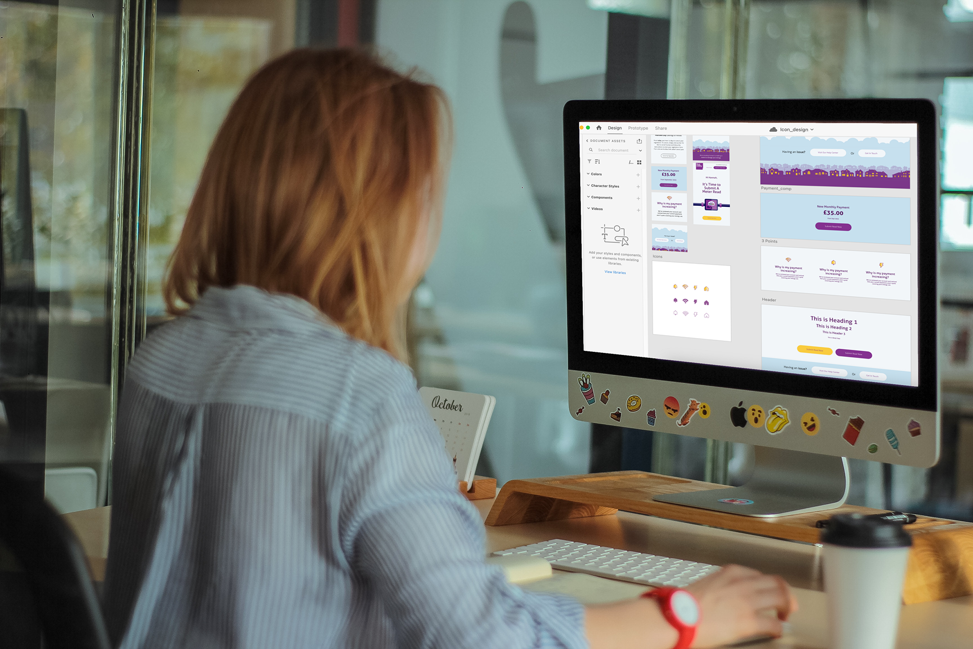
• Reusable components making emails faster to build and easier to engage with
The Result: Distinctly on-brand, easier to use, far more efficient to manage.
T H E W I N S
The Email Results
From disconnected templates to cohesive design system. From slow, manual builds to efficient, scalable production.
Design Time:
New email template creation: 4-6 hours → 30-45 minutes (83% reduction)
Template updates: 45 minutes → 8 minutes (82% reduction)
Icon creation streamlined
Development Time:
Email coding: 3-4 hours → 1-1.5 hours (62% reduction)
QA testing time: 2 hours → 35 minutes (consistent components had fewer bugs)
Team Capacity:
Email production capacity: 12 emails/week → 35 emails/week with same 3-person team
Designer time freed up: 12 hours/week for strategic projects
Reduced design bottleneck: Marketing could self-serve 40% of simple email requests
User Experience Improvements:
Engagement Metrics (6-month comparison):
Email open rates: 18% → 24% (consistent, cleaner design improved trust)
Click-through rates: 4.2% → 7.8% (clearer CTAs, better hierarchy)
Meter reading submissions from email: +31% (Sharp icons improved action clarity)
Email-driven call center inquiries: -22% (clearer information reduced confusion)
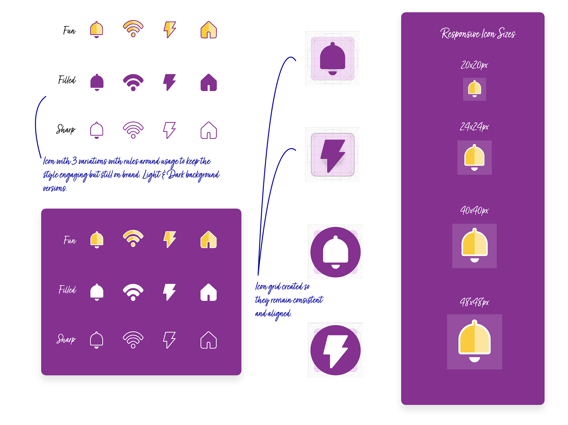
T H E I C O N S
Three Styles, One System
Built a flexible icon library solving a critical consistency gap.
The Problem: Existing icons were scattered and inconsistent—disjointed designs that confused meaning.
The Insight: One style wouldn't work for every context. Different messages need different tones.
The Solution—three distinct icon styles:
Fun — Social and marketing emails. Playful, engaging, human.
Filled — In-product UI and guides. Clear, instructional, supportive.
Sharp — Direct actions like meter submissions. Urgent, focused, unmistakable.
The Outcome: Consistency with flexibility. Icons that feel purposeful, on-brand, and instantly recognisable regardless of context.
T H E I M P A C T
The Results
User Confidence:
• Reduced drop-offs on critical actions through clearer hierarchy
• Familiar navigation patterns building user confidence
• Simplified layouts improving content comprehension
Team Efficiency:
• Hours saved per email with drag-and-drop components
• Consistent quality without designer bottlenecks
• Scalable system supporting constant email briefs
Brand Consistency:
• Unified visual language across all communications
• Strategic colour use improving accessibility and clarity
• Icon system adaptable to every message type
The Transformation: From disconnected templates to cohesive design system. From slow, manual builds to efficient, scalable production.