Role: Lead Designer | Timeline: 3 months | Tools: Sketch, InVision, Adobe XD, HotJar
T H E S O L U T I O N
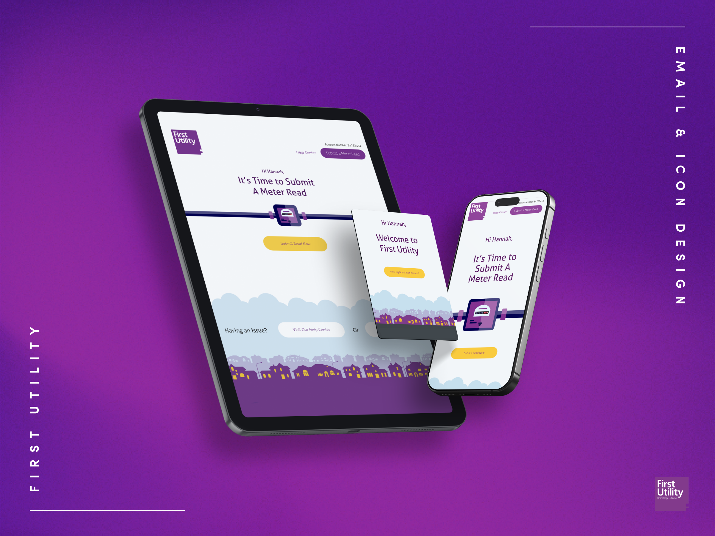
First Utility: Onboarding & Booking System
The Challenge: rescue First Utility's telco onboarding flow. Users were abandoning in droves, confused by plan options, unable to find promotional offers, and frustrated by a clunky booking system that forced them to wait six-hour windows for installation.
The numbers told the story: abandoned carts everywhere, users walking away frustrated before completing their journey.
T H E D A T A
The Problems
I started by analysing user behaviour data and conducting stakeholder interviews with the customer service team.
Three critical failures emerged:
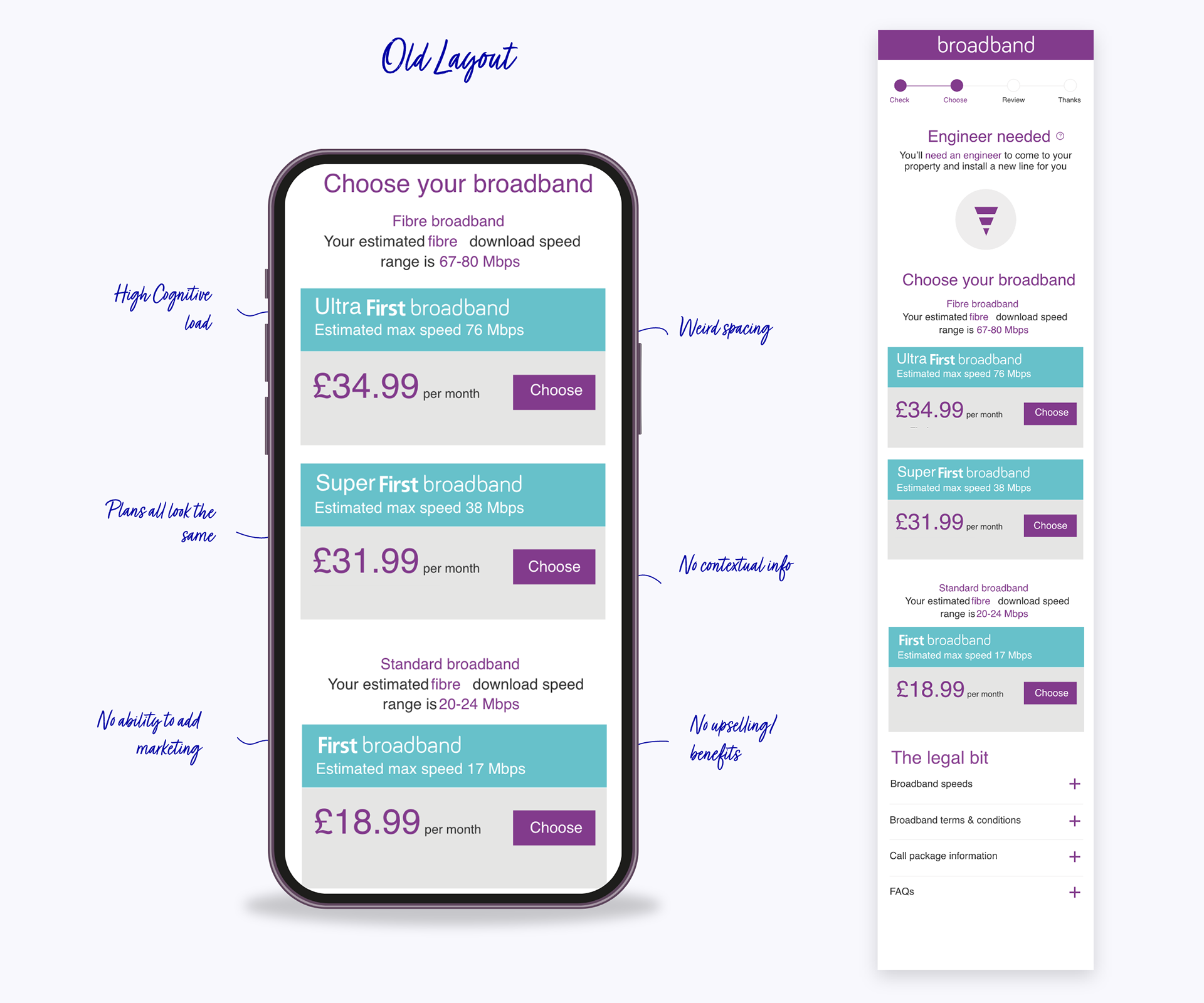
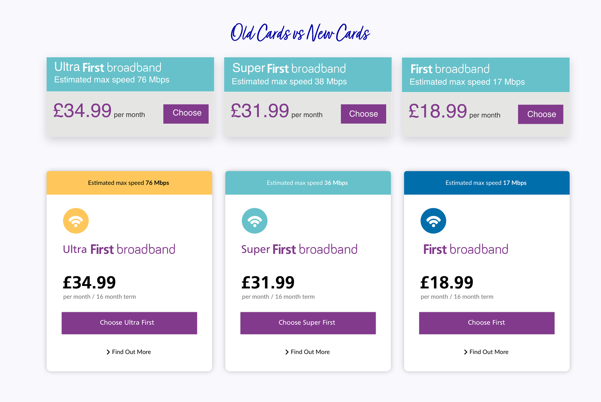
• The Context Crisis: Users couldn't tell which plan was better or why. Without comparative context, they froze at the decision point rather than converting.
• The Flexibility Gap: The rigid UI couldn't support dynamic content. Key promotions like "free installation" were buried or lost entirely, costing the business conversions on their best offers.
• The Cognitive Overload: Pure visual noise. Too much clutter, competing messages, no hierarchy. Users were overwhelmed instead of guided, leading to decision paralysis and drop-offs.
T H E S O L U T I O N
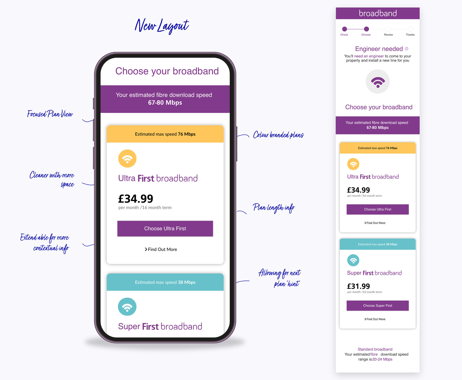
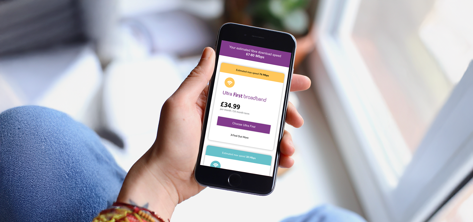
The Solution
I restructured the entire flow around user decision-making patterns, using card sorting exercises and heat map data to inform the new information architecture.
The Goal: surface critical details at precisely the right moments to guide users from confusion to confident conversion.
What I Built:
• Intelligent Promotional System: Automated promotional highlighting that adapts based on user behaviour and campaign priorities, ensuring the right offer surfaces at the right time without overwhelming the experience.
• Clear Visual Hierarchy: Eliminated competing messages through rigorous content prioritisation with stakeholders. Every element earned its place through user testing, creating a clean path to conversion.
• Dynamic Content Architecture: Built a flexible system that adapts to campaign needs without requiring dev resources. Marketing could launch new promotions in hours, not weeks.
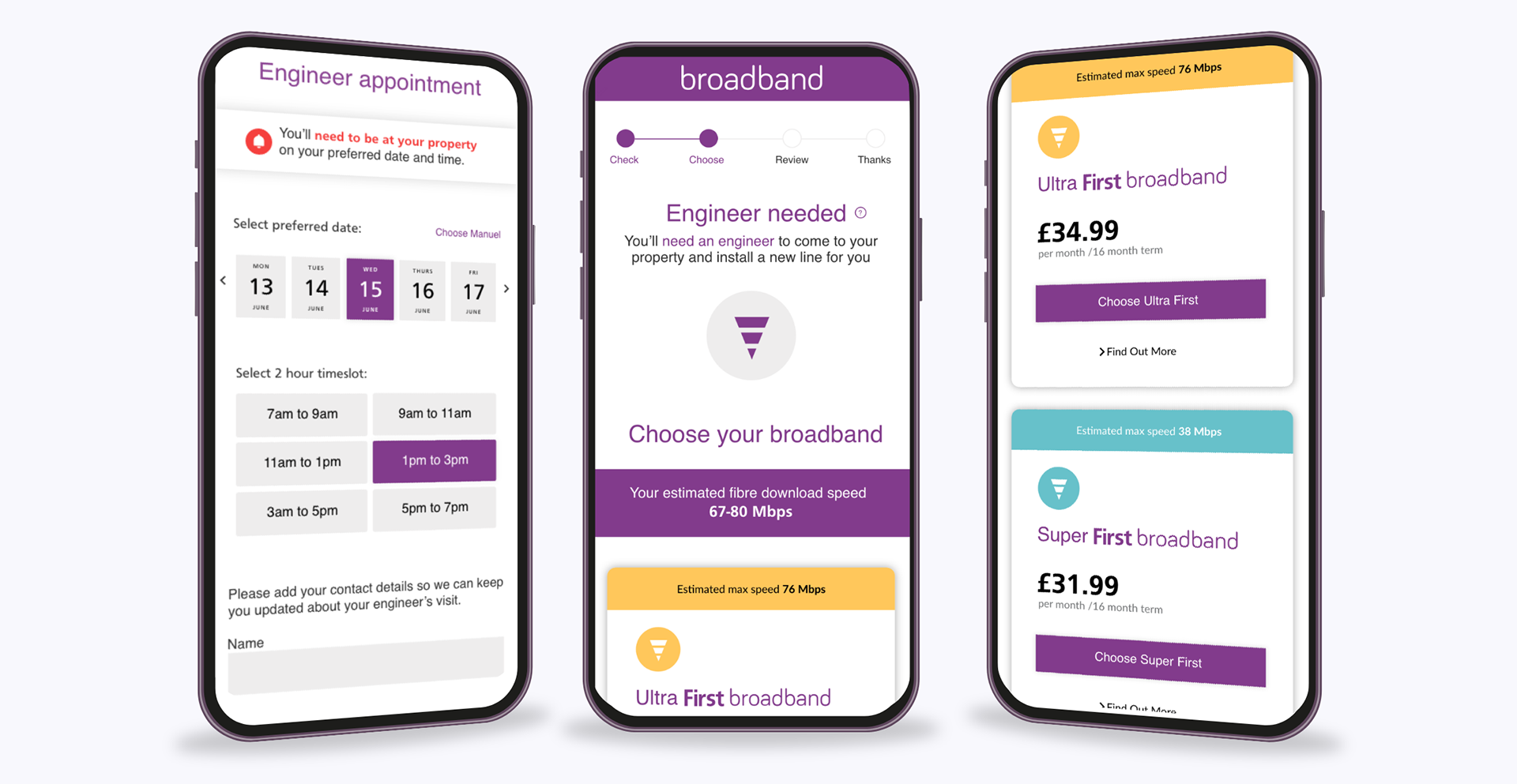
• Strategic Plan Differentiation: Redesigned plan comparison cards to highlight key differences at decision points, using progressive disclosure to prevent information overload while building user confidence.
T H E T O O L K I T
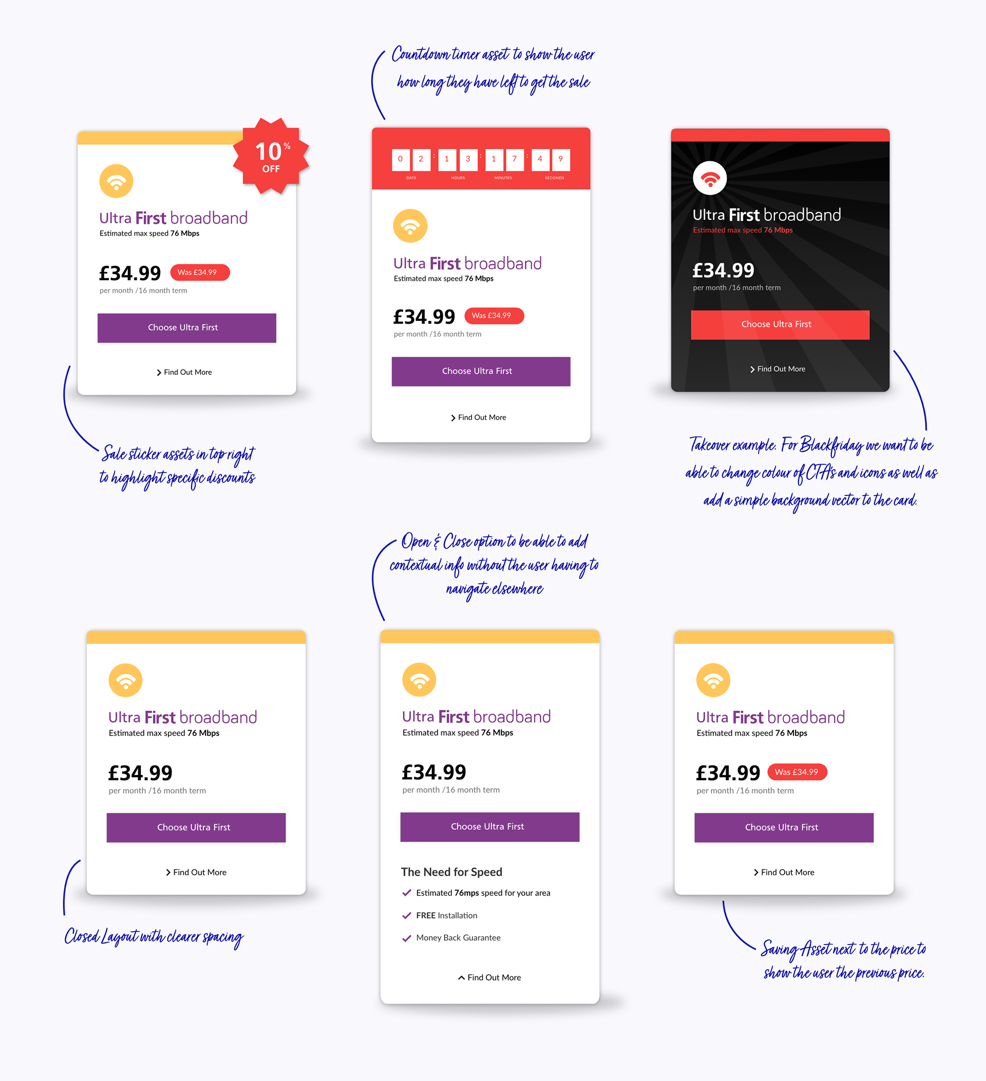
The Promotional Toolkit
I designed a complete promotional UI system with strategic usage guidelines, giving marketing teams flexibility without sacrificing brand consistency.
The Components:
• Countdown timers for urgency-driven campaigns
• Promotional stickers for visibility on specific features
• Plan takeover frames for major seasonal campaigns
• Clear usage rules defining when to combine elements vs. standalone application
The Strategy: Every promotional experience felt intentional and clean, maintaining focus regardless of campaign intensity. I created decision trees for the marketing team to determine which components to use based on campaign goals.
The Results:
• Countdown timers + promotional stickers together drove 25% conversion lift on promotional plans
• Timers alone accelerated upgrade decisions 12% faster than control groups
• Marketing team reduced campaign launch time from 3 days to 4 hours
.
U P D A T I N G T H E E X P E R I E N C E
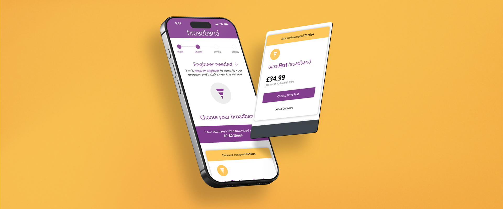
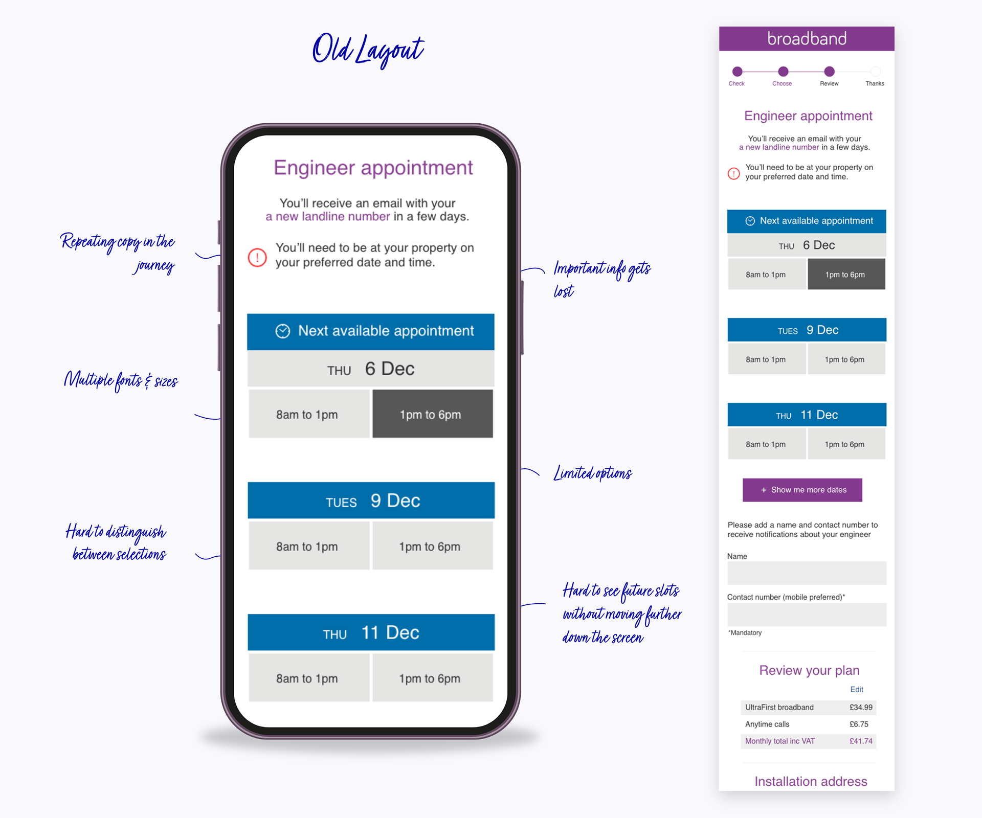
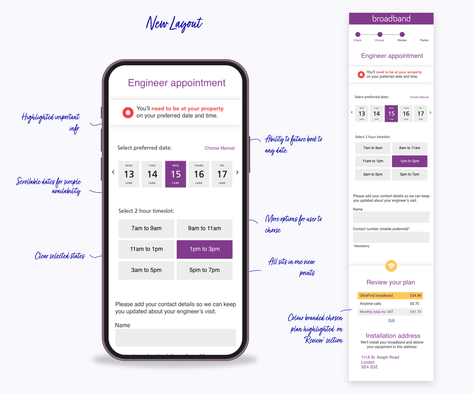
The Booking System
The existing booking system was killing conversions. Six-hour time slots forced customers to waste entire days waiting for installation, and bookings scheduled weeks out led to abandonment.
My Solution:
• Championed 2-Hour Slots: Worked directly with operations and product teams to prove the business case for reducing slots from 6 hours to 2. Presented user research showing that installation time flexibility was the #2 reason for drop-offs. The operational change gave users precision and control while improving installer efficiency.
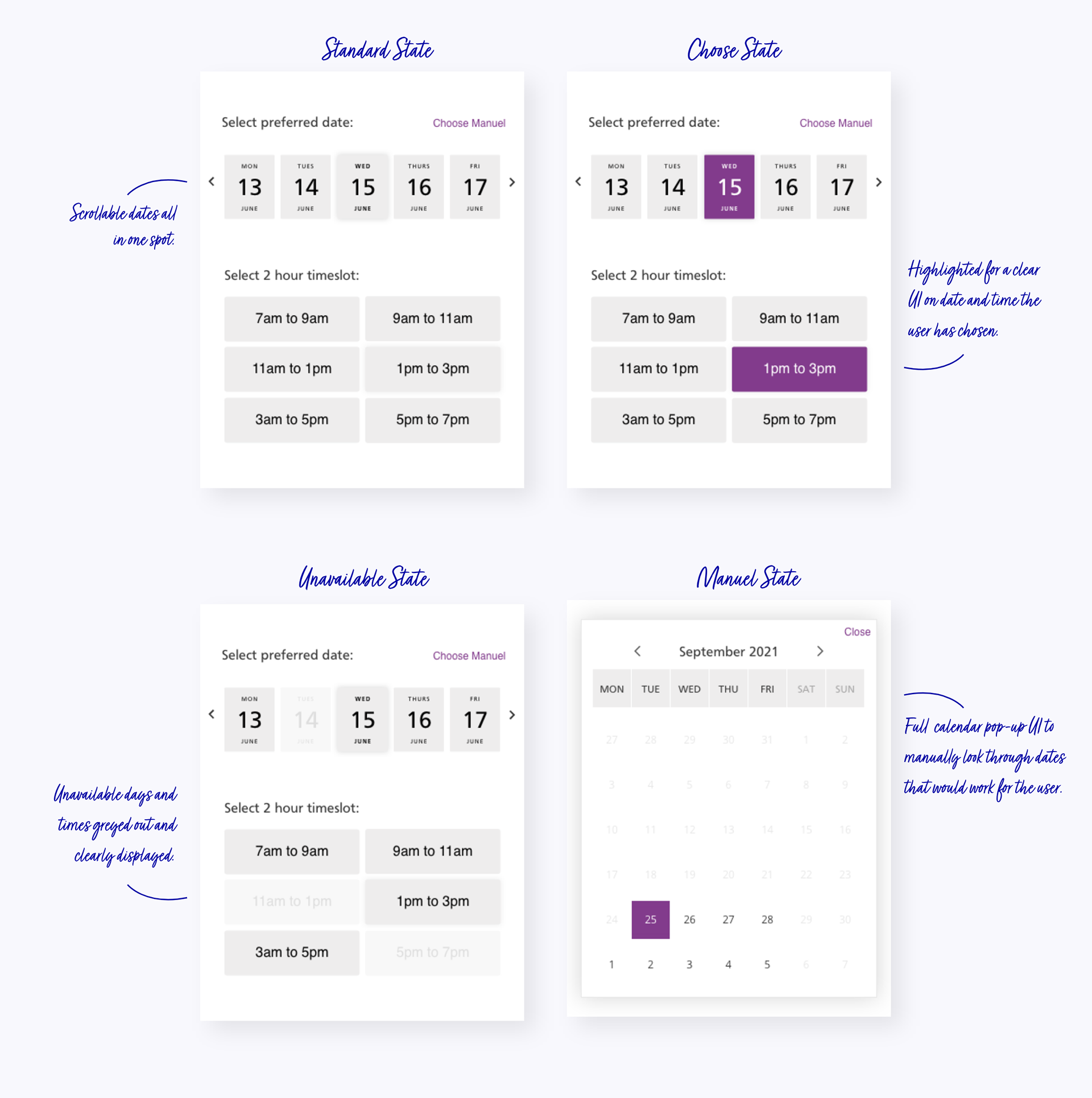
• Reimagined the Interface: Replaced clunky "View More" pagination with an intuitive horizontal swipe calendar. Users browse upcoming days seamlessly, with available slots appearing directly below their selection—no page reloads, no friction, no confusion.
• Added Flexibility Introduced manual calendar pop-up for power users who want to jump to specific dates instantly, while maintaining the simple swipe experience as the default path.
Clear Visual Language:
• Greyed-out dates = unavailable
• Highlighted = selected
• Instant visual feedback at every interaction
• Progressive disclosure preventing calendar overwhelm
The Psychology: Reduced cognitive load by showing only relevant information at each step while giving users the feeling of control over their booking experience.
T H E S U C C E S S
The Impact
This wasn't about fixing broken screens—it was about understanding user psychology at each decision point and creating experiences that guide confident actions.
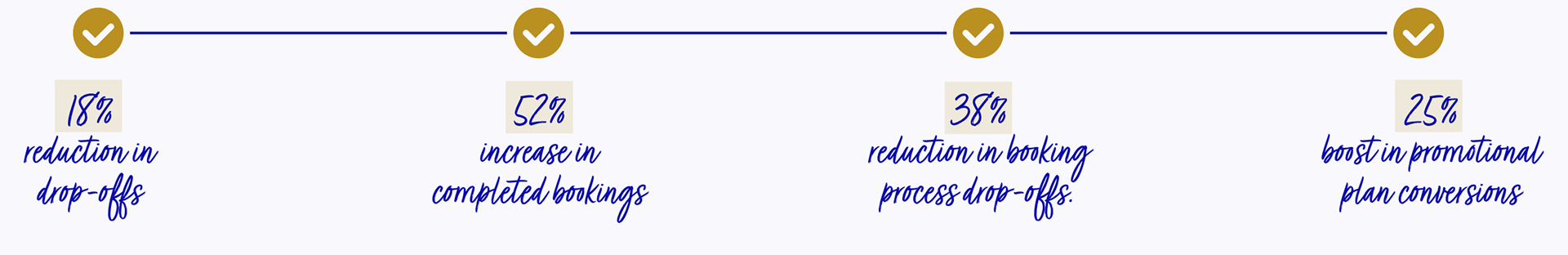
Onboarding Improvements:
• Plan selection drop-offs reduced by 18%
• Single-session completions increased 28%
• Users reported clearer understanding of plan differences (post-launch survey)
Booking System Redesign:
• Booking completion rate improved from 62% → 79%
• Average completion time: 8 minutes → 4.7 minutes
• Customer service calls about booking confusion reduced 22%
Promotional System:
• Promotional plan conversions increased 19-25% depending on campaign
• Countdown timers accelerated upgrade decisions
• Marketing team could launch campaigns independently in 4 hours vs. 3 days