Role: Senior Designer | Timeline: 2 months (system build) | Tools: Adobe Creative Suite, Figma
C R E A T I V E C H A L L E N G E
Vanarama: Scalable Social Design System
The Brief: Scale Vanarama's social content production without sacrificing brand quality or burning out the creative team.
The Challenge: Every post was designed from scratch. No templates, no system, no consistency. The creative team was drowning in requests, missing trending moments, and producing off-brand work under impossible deadlines.
The Numbers:
• 47 social posts per week across 4 platforms
• Average creation time: 2-3 hours per post
• 2-person creative team handling all social content
• Missed 80% of trending moments due to slow production times
The Real Issue: We were designing content when we should have been designing a system.
S Y S T E M S O L U T I O N
The Discovery
I started by auditing 3 months of social content and chatting with the team about their pain points.
What I Found:
• The Bottleneck: Every post required full designer attention. Junior team members struggled to contribute because there were no templates or guidelines. This created a creative bottleneck where all requests funnelled through one senior designer.
• The Inconsistency: Without templates, brand consistency depended on individual designer memory. Post quality varied wildly based on who created it and how much time they had.
• The Opportunity Cost: Time spent on repetitive execution meant no time for strategic campaigns, creative experimentation, or trend participation. The team was reactive, never proactive.
• Team Buy In: With almost every member of the team having picked up a social brief at some point it was vital to get the feedback and collaboration of the design team from the start. Making sure the templates were not about stifling creativity but laying the groundwork for an evolving social suite.
The Insight: We needed two parallel content tracks—one for speed (reactive content), one for strategy (planned campaigns).
T R A C K 1
Reactive Content System
The Challenge: Keeping up with trends was vital for our social team. Trending moments have a short lifespan. Our previous creation time meant we missed 80% of relevant trends.
The System:
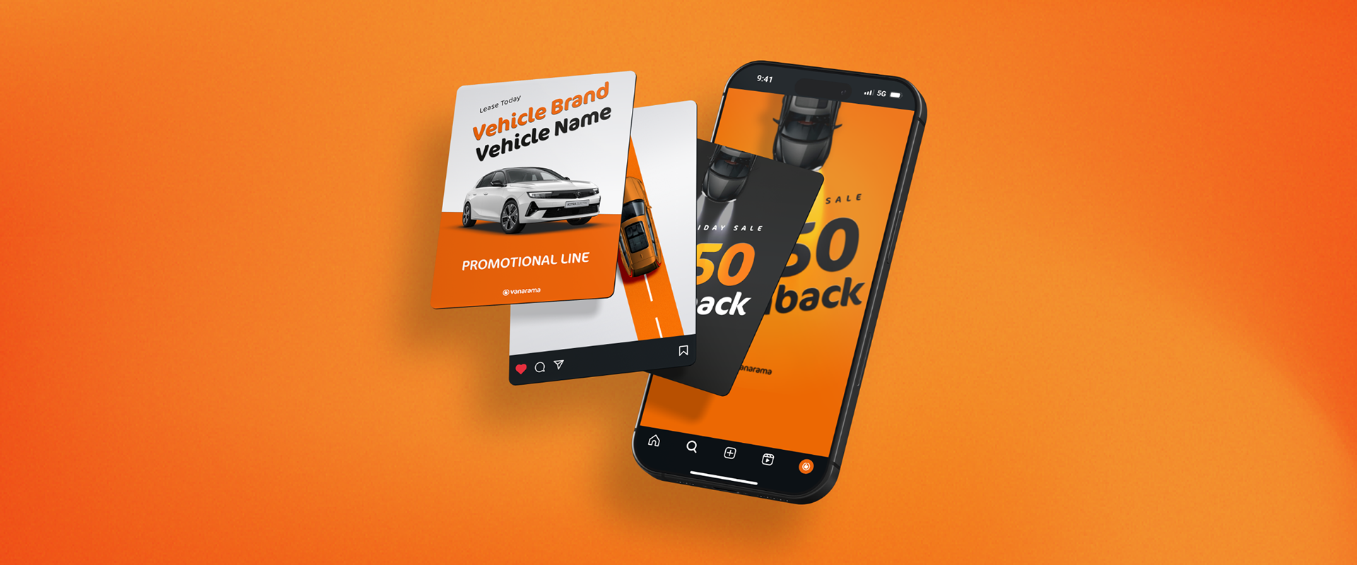
• Modular frames with instant image-swapping
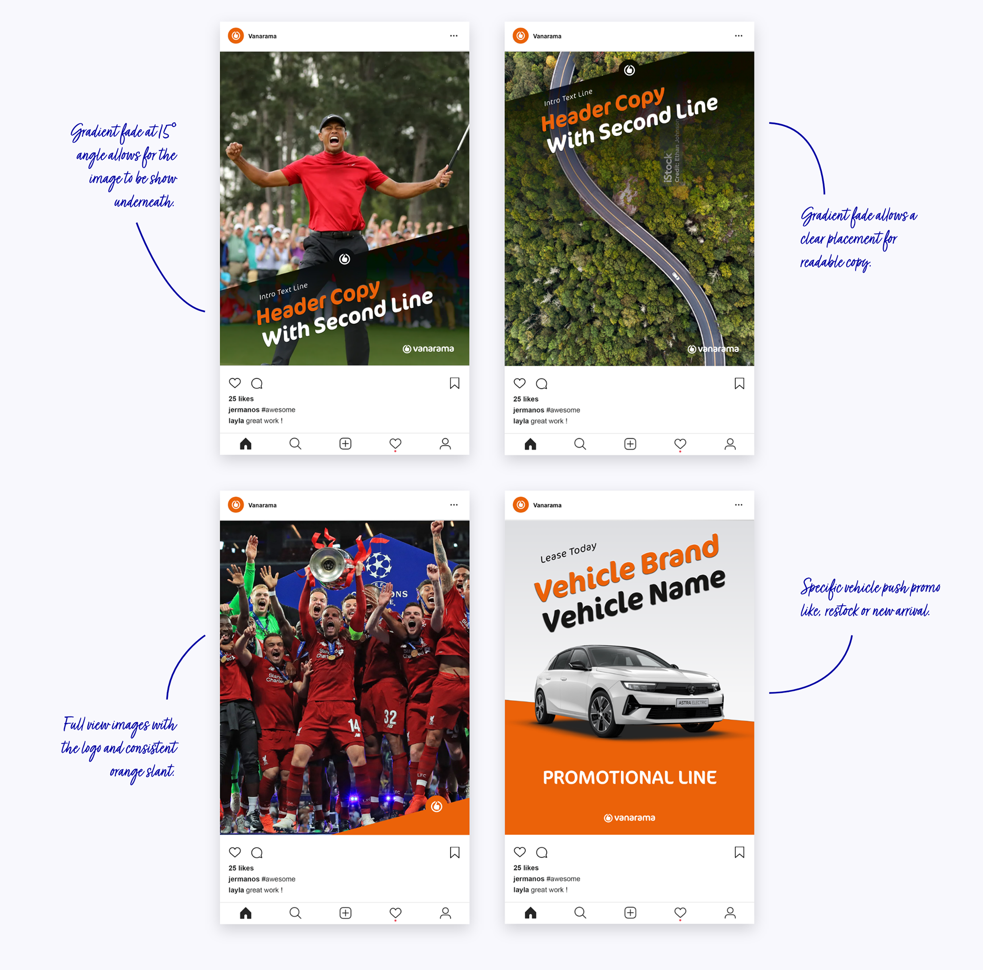
• Signature 15° slanted typography (locked angles, consistent shadows)
• Dynamic gradient overlays that guaranteed text legibility on any background
The Results: No more hunting for perfect whitespace or rejecting great images. The system automatically handled contrast, letting the team move fast without compromising quality.
Before vs After:
• Average reactive post creation time: 2-3 hours → 6 minutes
• Trend participation rate: 20% → 85%
• Brand consistency score: 61% → 82% (measured through internal brand audit)
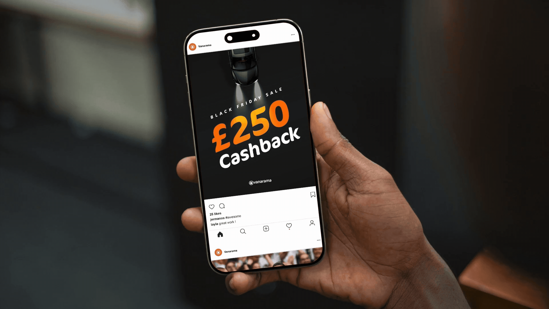
T R A C K 2
Planned Campaign System
Built for adaptability. Strategic campaigns needed to work flawlessly across social, email, and web without losing impact.
The Design Philosophy:
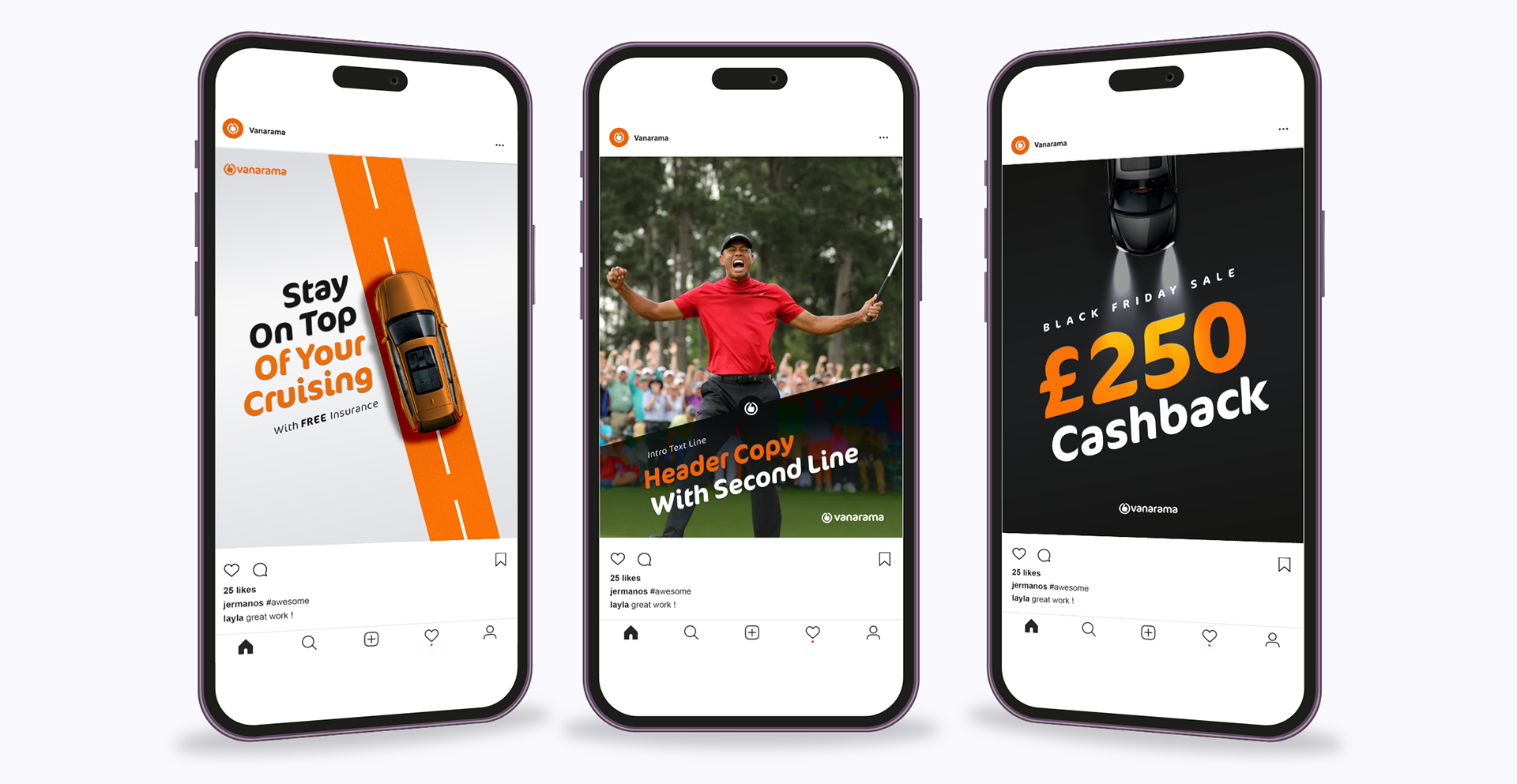
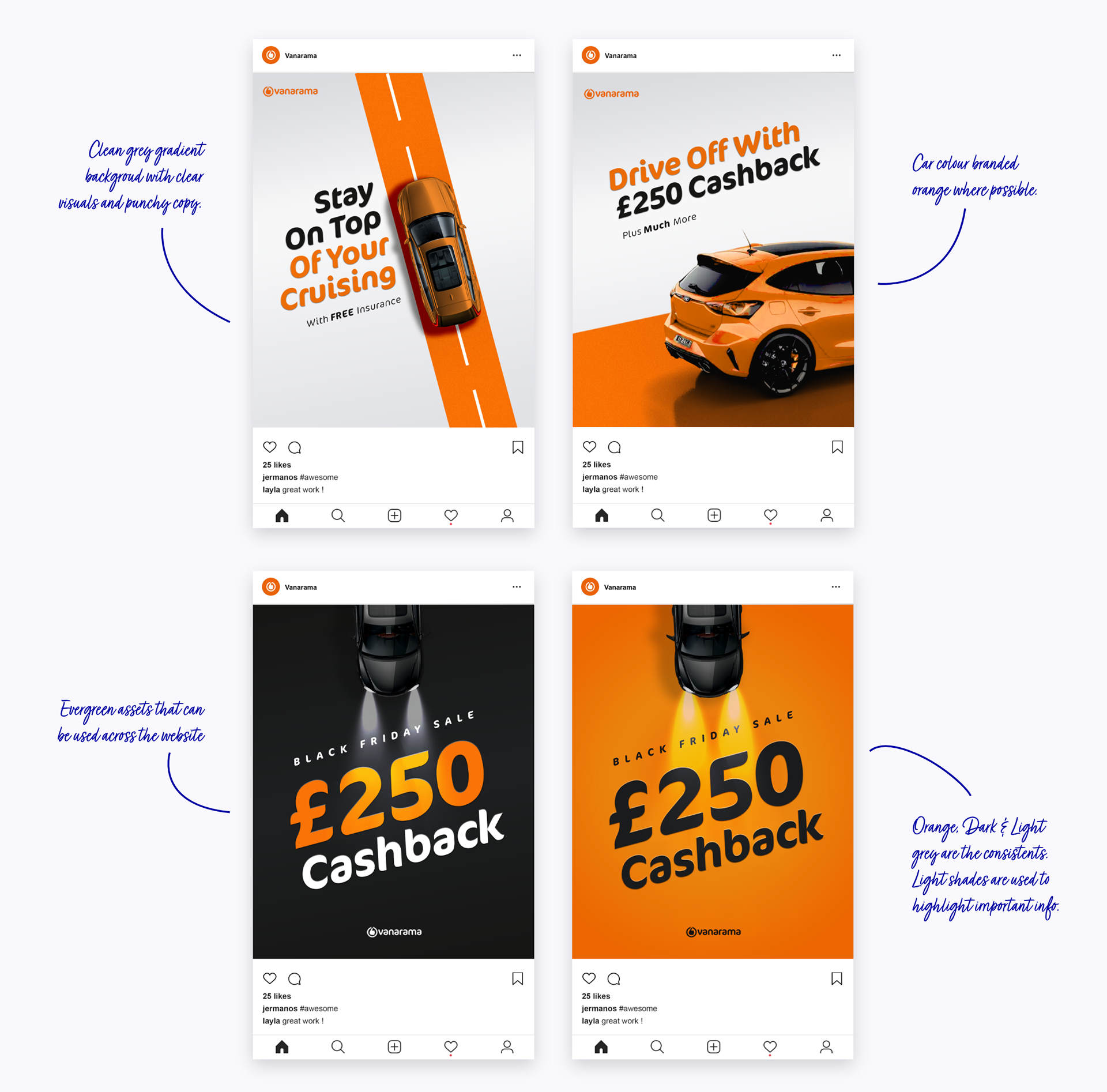
Spotlight: One dominant focal point—no visual competition. In user attention studies, posts with single focal points received 2.3x more engagement than busy, multi-element designs.
Space: Generous whitespace that signals premium over amateur. Vanarama was moving upmarket—the design needed to reflect that positioning.
Spark: Unexpected elements that disrupt predictable scrolling. Subtle animations, unusual crops, or compositional surprises that stop thumbs mid-scroll.
The Constant: That 15° slant became our signature across both tracks. Instant brand recognition while everything else flexed to campaign needs.
Colour Strategy:
A minimal palette anchored by strategic brand orange bursts gave creative freedom within unmistakable brand guardrails:
Neutral base: Blacks, whites, and grays for 80% of the design
Orange energy: Reserved for focal points, CTAs, key messaging, and brand moments
Flexibility: Campaign-specific accent colours permitted, but orange always present as brand anchor
s h a r e d l i b r a r y
Building the System Architecture
Created a comprehensive shared library accessible to the entire team, not just designers.
What I Built:
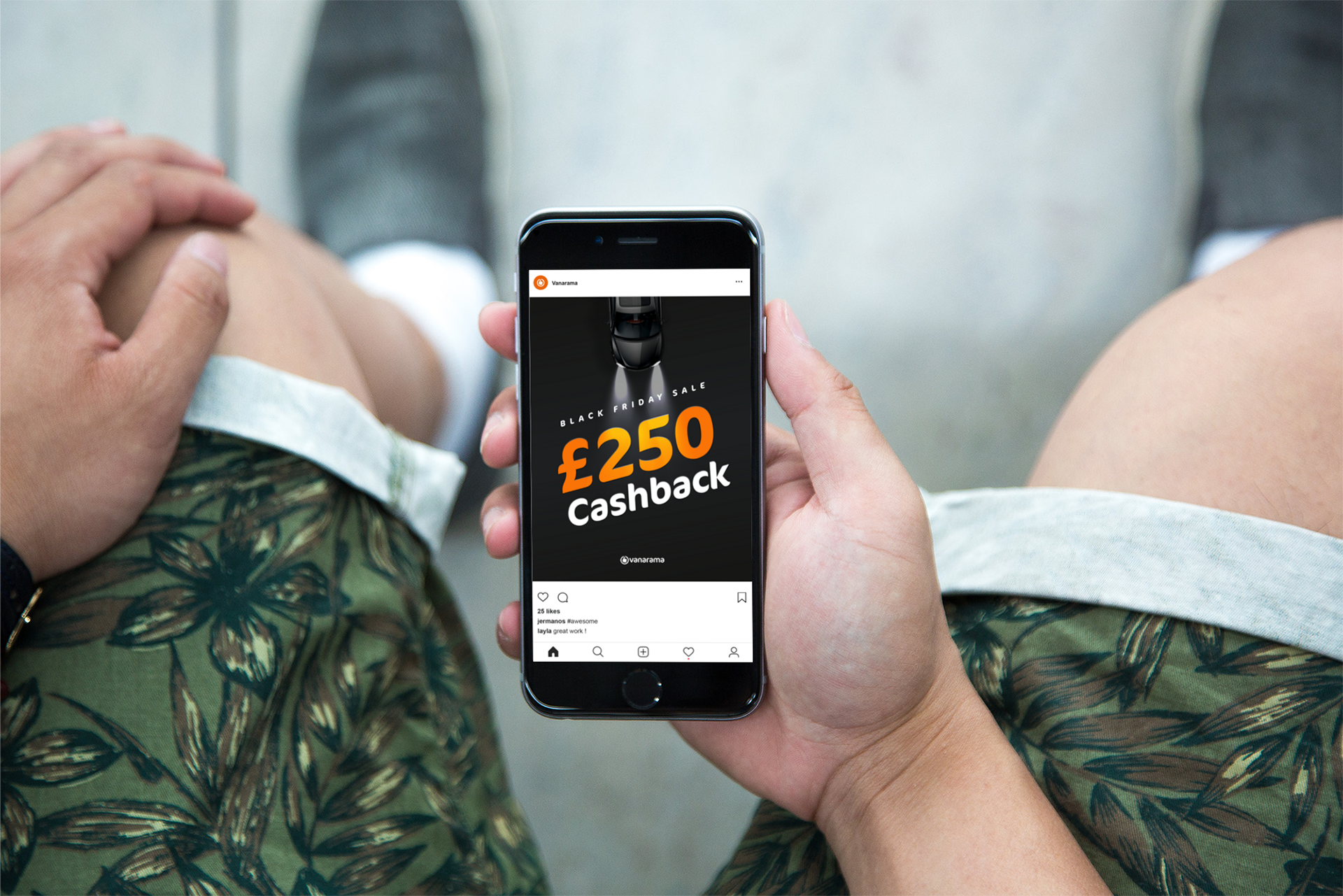
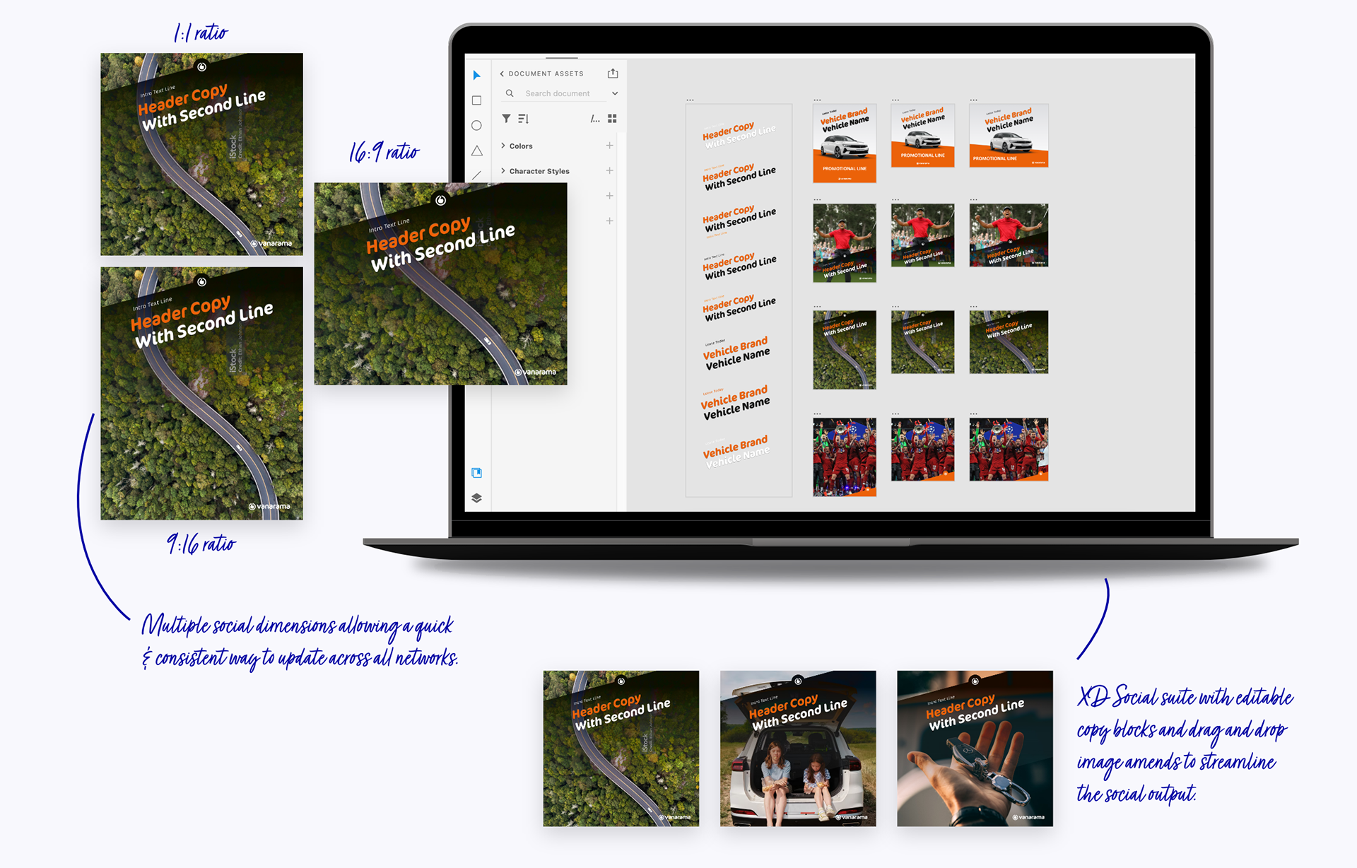
• Social templates covering all platforms (Instagram feed/stories, TikTok, Twitter, LinkedIn)
• Platform-optimised sizing (no more manual resizing)
• Linked components for instant global updates
• Variant switching for different content types
• Adobe XD shared asset suite
• Smart objects for one-click image swapping
• Character and paragraph styles for typography consistency
• Colour libraries synced with brand guidelines
Key Principles:
• Transferable assets across all platforms
• Modular components, not rigid templates
• Speed without sacrificing brand integrity
• Linked assets for quick and scaleable updates
R E F L E C T I O N
The Takeaways
The Result: A design system that scaled content production while elevating brand quality. No creative bottlenecks, just seamless production at the speed of business.
Before:
• Every post designed from scratch
• Hours-long creation cycles
• Missed trends and opportunities
• Brand inconsistency across platforms
• Creative team bottleneck
After:
• Grab-and-go template efficiency
• Minutes-long creation cycles
• Real-time trend response
• Automatic cross-platform consistency
• Entire team empowered to create on-brand content independently
• Engagement improvements across every social metric
Some Insights:
Brand audit score: 61% → 82%
Team autonomy: 0% → 65%
Impressions per post: +28% average
Engagement rate: 2.1% → 4.8%