Role: Brand & Digital Designer | Timeline: 2 months | Tools: Adobe Illustrator, Figma
B R A N D I N G & D I G I T A L
MotherGorilla: Complete Brand & Digital Experience
The Brief: Design a complete brand identity and website for MotherGorilla, a guerrilla projection team collaborating with major global brands like Nike, Adidas, and Samsung.
The Challenge: Capture their unconventional spirit in branding and digital presence. Feature a gorilla. Everything else? Completely open-ended.
The Opportunity: This level of creative freedom is rare. But freedom without strategy leads to indulgent design. I needed to find the constraints that would make the work meaningful.

D E E P D I V E
The Research
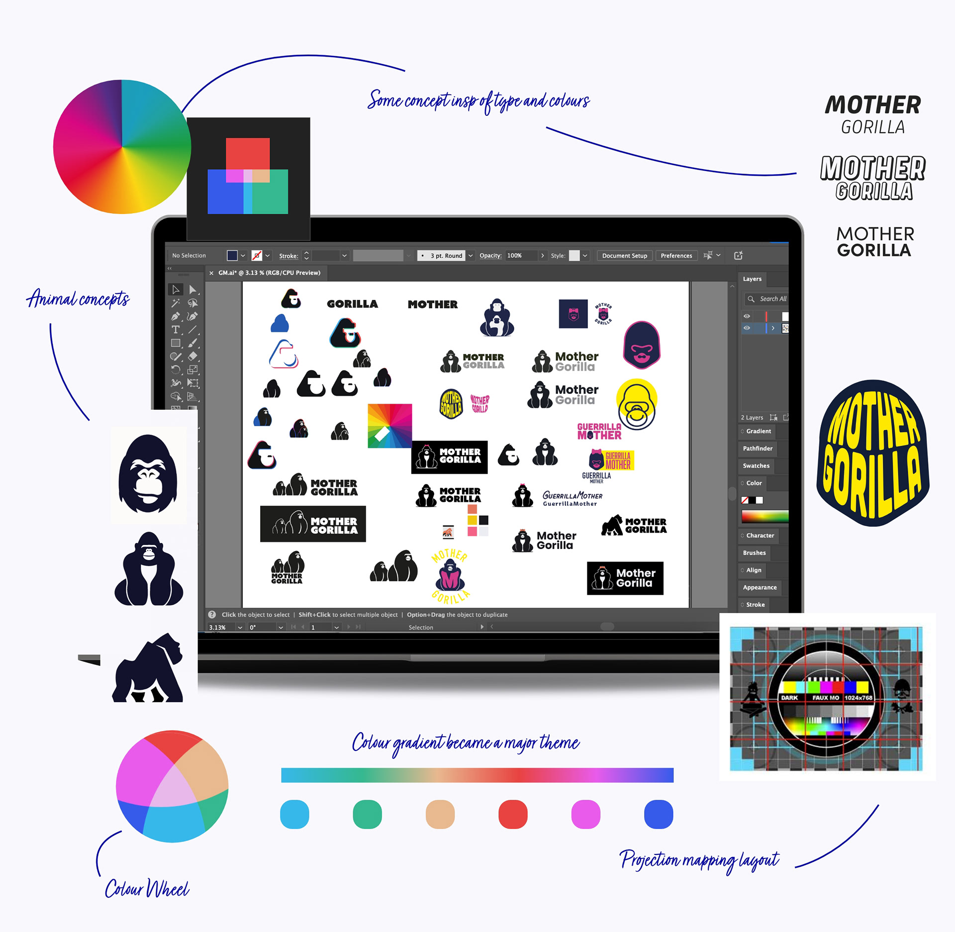
With minimal constraints, I started where good design begins: understanding the work itself.
MotherGorilla specialises in large-scale projection mapping—casting dynamic imagery onto buildings, structures, and urban spaces at night. This wasn't just their service; it was their visual DNA.
The Insight: Their medium should inform their identity.
I analysed projection mapping techniques and found a rich visual language: projection grids, calibration keys, chromatic gradients, retro VHS overlays, and early digital aesthetics. There was something compelling about this intersection, utility meeting nostalgia. The colour prism aspect was something I want to include. Using that as a foundation of the concept to bring the Gorilla to life.
But there was a critical constraint hiding in plain sight.
S E E I N G T H E L I G H T
Designing for Darkness
Most logos are designed for optimal conditions: white backgrounds, good lighting, printed materials, digital screens with backlighting.
MotherGorilla's work lives in the opposite environment.
The Technical Problem:
• Projections appear on dark buildings at night
• Marketing materials primarily exist on black backgrounds (their natural habitat)
• The brand also needs to function in daylight mockups, white presentations, and traditional media
• Thin lines disappear in low light. Subtle colours vanish. Fine details get lost
The Solution Strategy: Design an identity with extreme contrast adaptability. It needed to maintain legibility and impact whether placed on pure black, pure white, or anything in between.
This constraint would shape every decision: form, colour, contrast, weight, negative space.
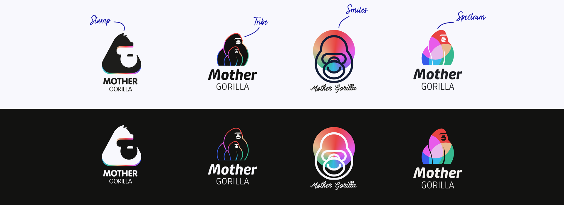
With This Constraint In Mind: I developed four complete directions, each testing a different approach to visibility while expressing different brand concepts from my research:
• Direction 1: Stamp Maximum simplicity. Geometric gorilla silhouette with gradient fill. Infinitely scalable, utterly professional, but potentially forgettable.
• Direction 2: Tribe Storytelling through scale. Two abstract gorillas (one large, one small) referencing both projection scale and collaborative partnership. Unique and humanised, but complex at small sizes.
• Direction 3: Smiles Personality meets precision. Geometric gorilla face with spotlight gradient, paired with hand-drawn typography. Approachable sophistication, but the custom type limited flexibility.
• Direction 4: Spectrum Technical solution. Stylised gorilla with integrated colour mesh wheel. Multi-color gradient creates natural contrast on any background—bright colors pop on dark, dark values define on light, full spectrum reads on gray.
D I S T I N C T I V E
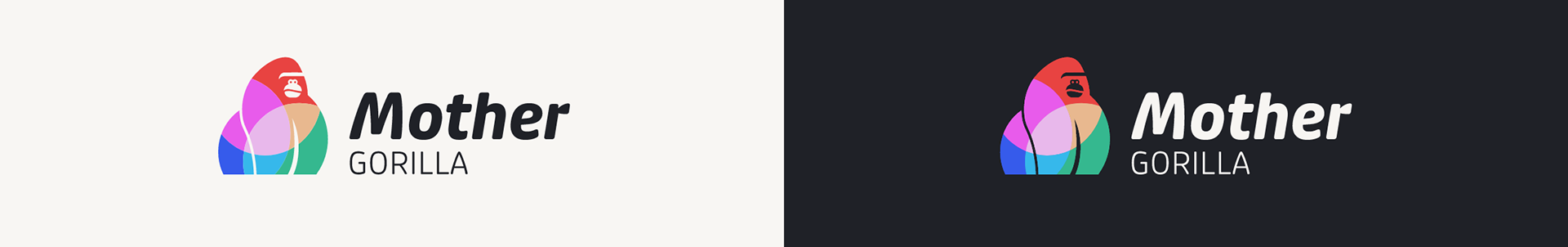
Why Spectrum Won
The team connected with Spectrum immediately, but the choice wasn't just emotional—it was strategic.
Why it worked:
Solved the core technical challenge: The colour mesh provided built-in contrast adaptation. Solved the visibility challenge elegantly, bright colours pop on dark, dark values define on light, full spectrum reads on grey
Future-proofed the brand: The stylised, abstract approach felt contemporary without chasing trends. It could evolve with the company without becoming dated.
Captured the duality: Bold enough to represent large scale projection work, but nuanced enough to show creative sophistication. Professional credibility with guerrilla energy.
Memorable and distinctive: In a sea of minimal, monochrome tech brands, Spectrum stood out immediately—just like their projection work stands out on city buildings.
The team said it perfectly: "Distinctive, characterful, a bit offbeat—but still sharp and easily recognisable."
S T Y L E G U I D E
Building the Identity System
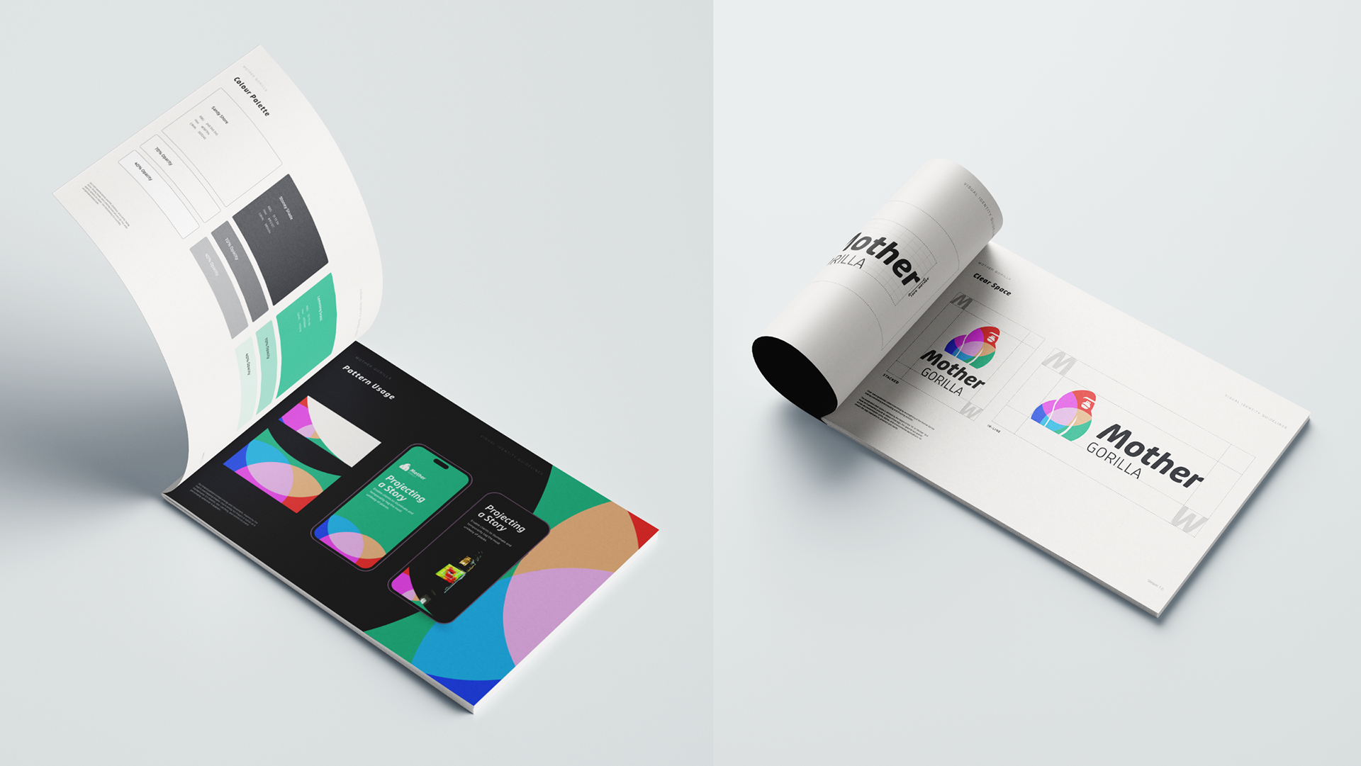
With the core mark selected, I developed the complete brand architecture:
Logo Variations:
Primary lockup (horizontal orientation)
Stacked version (for square and vertical applications)
Inverted versions (for light backgrounds where needed)
Monochrome fallbacks (for single-colour reproduction in print or embroidery)
Minimum size specifications ensuring legibility across applications
Typography System:
• Primary wordmark using slanted sans-serif (Bebas Neue) to echo projection movement and directional energy
• The italic angle references the dynamic nature of their work
• Secondary "Gorilla" lockup for supporting applications
• System fonts (Helvetica/Arial) for body copy maintaining readability across platforms and email clients
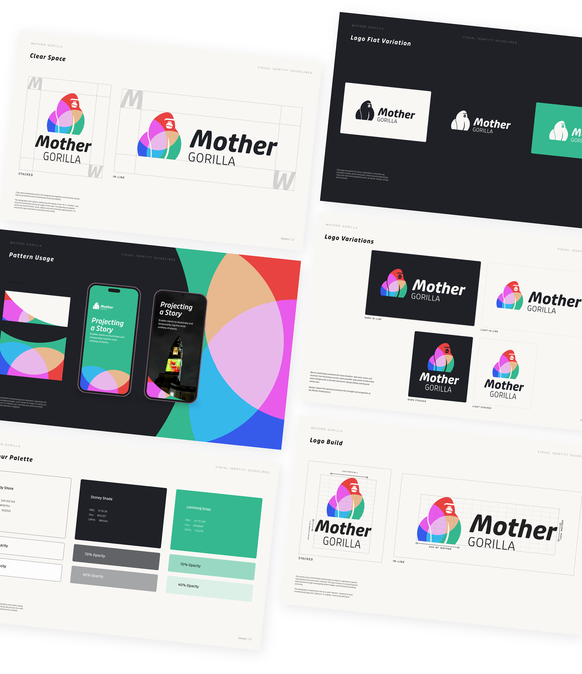
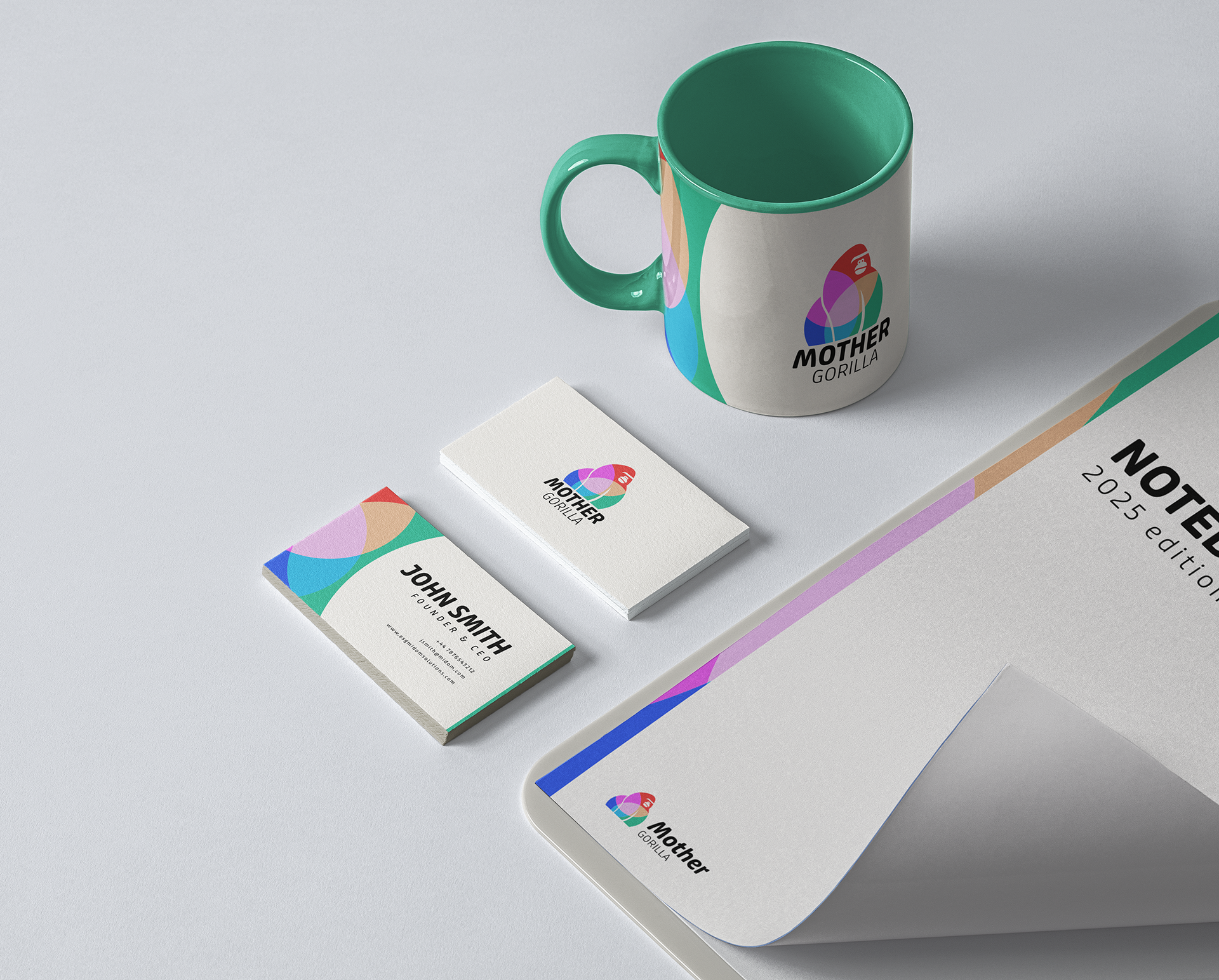
Colour Strategy:
Core palette: Soft white (#F5F5F5) and dark charcoal (#2B2B2B)—neutral anchors that work universally
Signature element: The multi-colour wheel style reserved exclusively for the logo mark—this became the brand's only colour pop, making it unmistakable
Application rule: Keep everything else minimal. Let the logo do the heavy lifting
Pattern creation: Colour wheel segments could be extracted as graphic elements for marketing materials and social content
Brand Patterns:
Created a library of supporting graphic elements derived from the colour wheel and gorilla form. These patterns could be used in:
• Social media templates
• Presentation backgrounds
• Print materials
• Video overlays
The Philosophy: An identity that's bold yet adaptable. Works on a projection 50 feet tall or a business card 2 inches wide. Unmistakably MotherGorilla in any context.
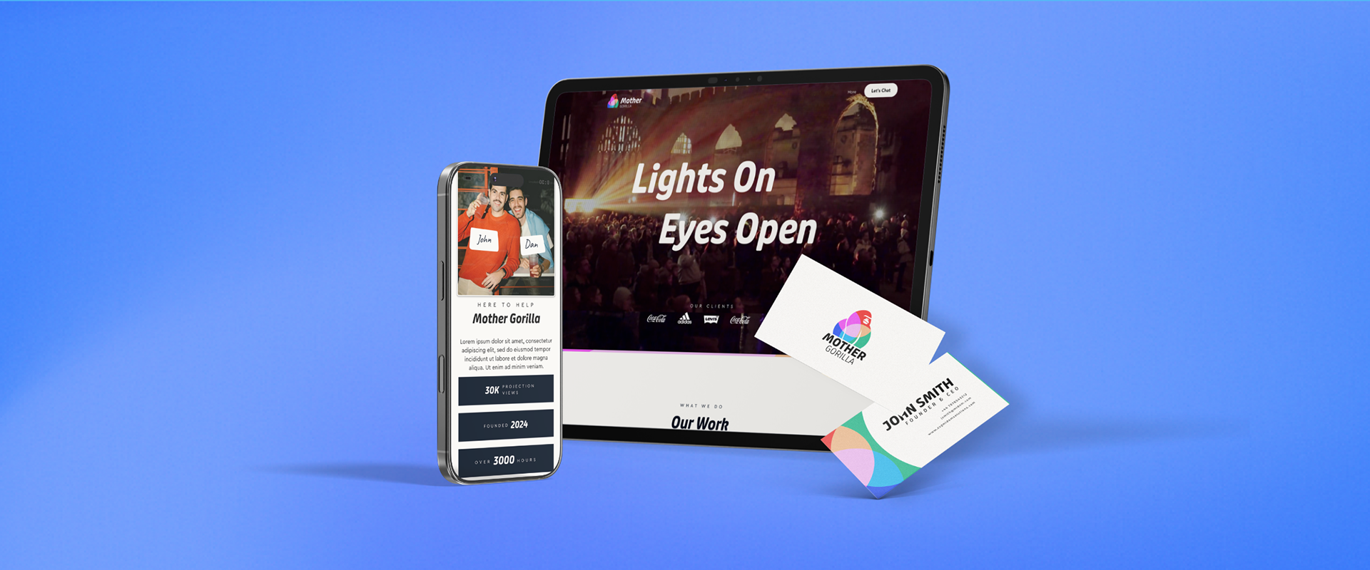
O N L I N E E X P E R I E N C E
The Website Strategy
With the identity locked, I moved to digital. The website had one primary job: establish immediate credibility.
The UX Challenge:
Guerrilla projection is niche. Most potential clients have never hired a projection mapping team before. They need instant proof of capability, not lengthy explanations.
The Strategy:
Flip traditional agency structure. Put credibility above the fold, no scrolling for validation.
What I Designed:
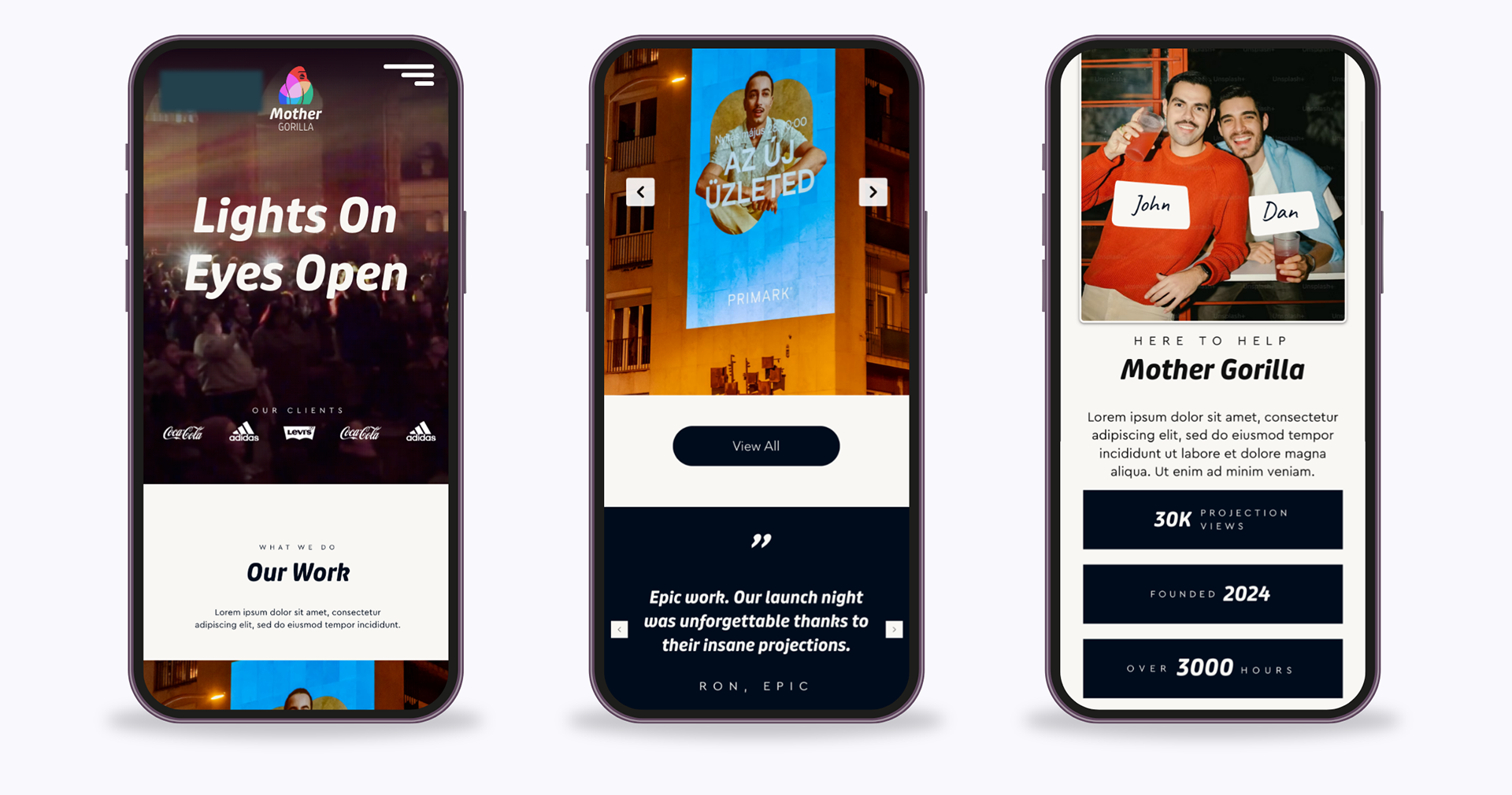
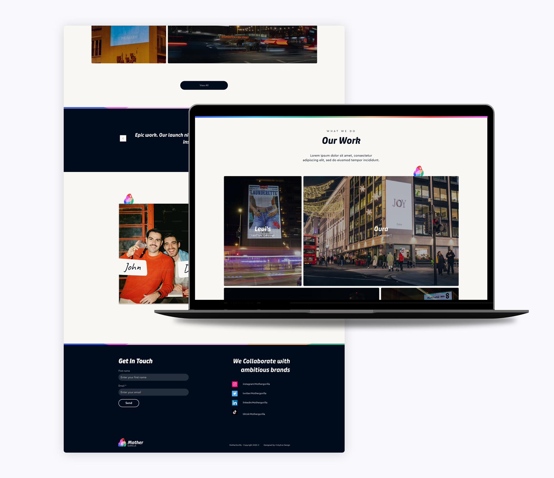
Homepage: Credibility First
• Major brand logos (Nike, Adidas, Samsung) placed high, immediately visible
• Visual-first layout with large, embedded video hero showcasing work in action
• Tiled work grid below the fold for deeper exploration
• Minimal copy—letting the work speak louder than words
About Page: Personality-Driven
While most projection companies lean corporate, I crafted an About page that emphasized the team's guerrilla spirit and creative approach. This differentiation became a talking point in client meetings.
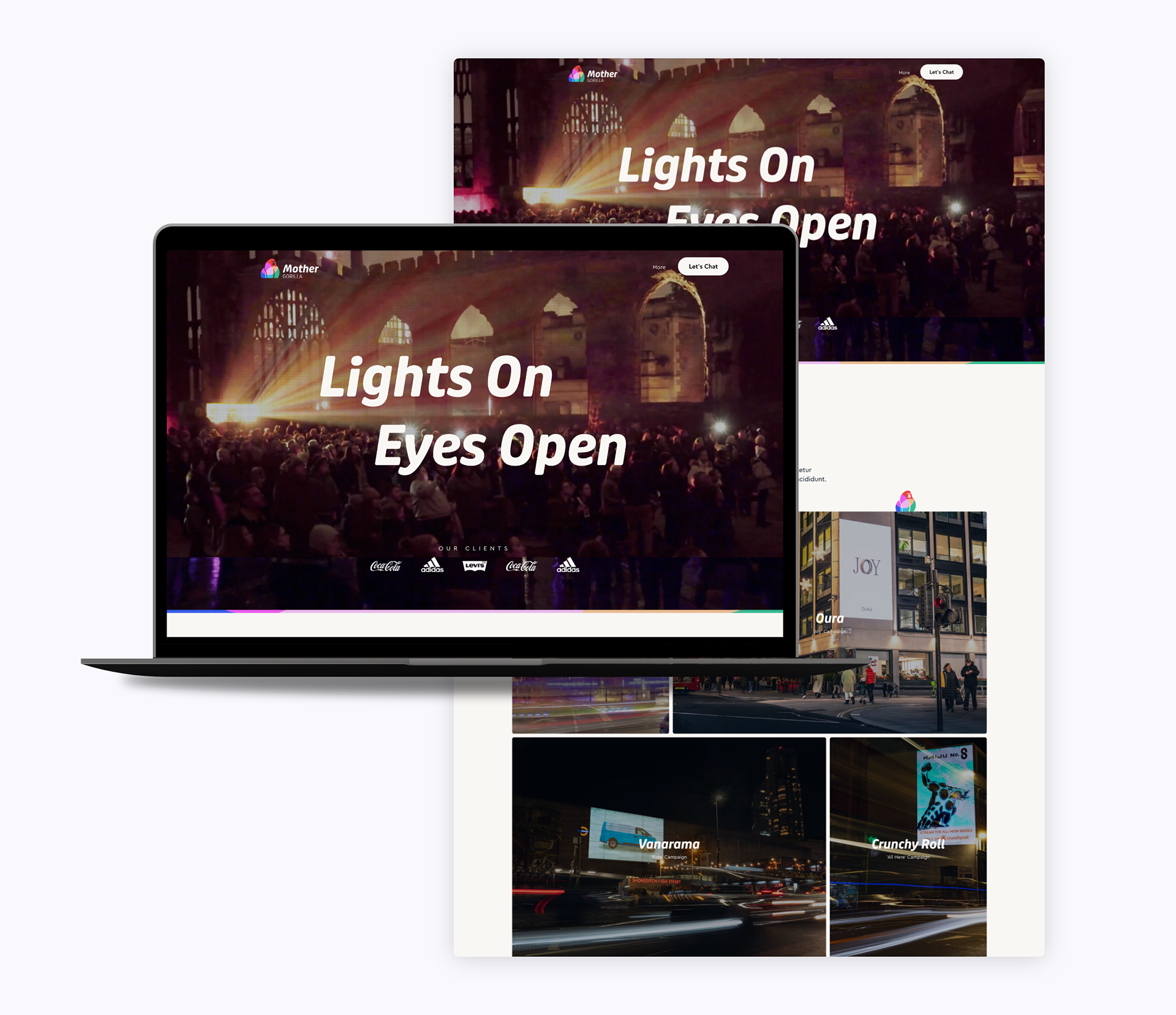
Work Gallery: Immersive
Full-screen image layouts with subtle scroll-triggered parallax. Each project showcased at maximum impact, mimicking the scale of their real-world projections.
Contrast Play
Alternating light and dark sections throughout the site, making the vibrant Spectrum logo pop against every background—demonstrating its versatility in practice.
Mobile-Optimised
With many discovery moments happening on-the-go (events, conferences, social scrolling), mobile needed to be flawless. Fully responsive layouts with touch-optimised galleries.
The Philosophy: Let the work speak. Keep the interface invisible. Create an experience that feels as bold and unconventional as the projections themselves.
R E F L E C T I O N
The Impact
Delivered a complete brand ecosystem in 8 weeks:
Deliverables:
• Core logo identity with strategic rationale documentation
• Four exploratory directions demonstrating design thinking process
• Complete identity system (typography, colour, format variations)
• Comprehensive brand guidelines
• Full website design and UX strategy
• Social media templates and content framework
• Scalable design framework for future growth
Client Feedback: "The brand gave us a voice we didn't know we needed. We went from 'the projection guys' to having a distinct identity that matched the scale and creativity of our work." - John A. co-founder, MotherGorilla