Role: Illustrator & Visual Designer | Timeline: 6 weeks | Tools: Adobe Illustrator, Photoshop
T H E C H A L L E N G E
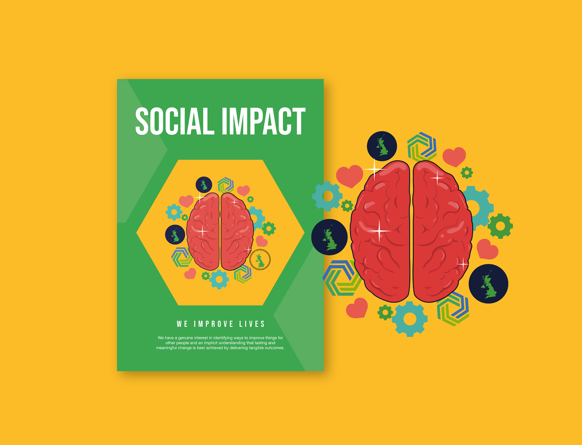
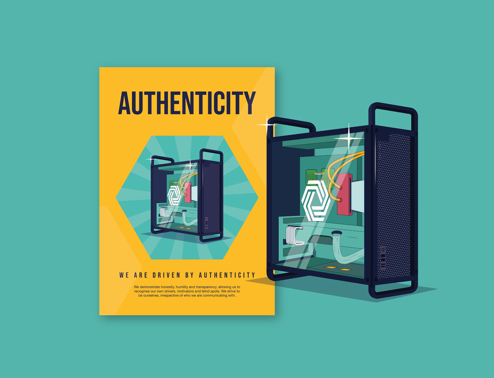
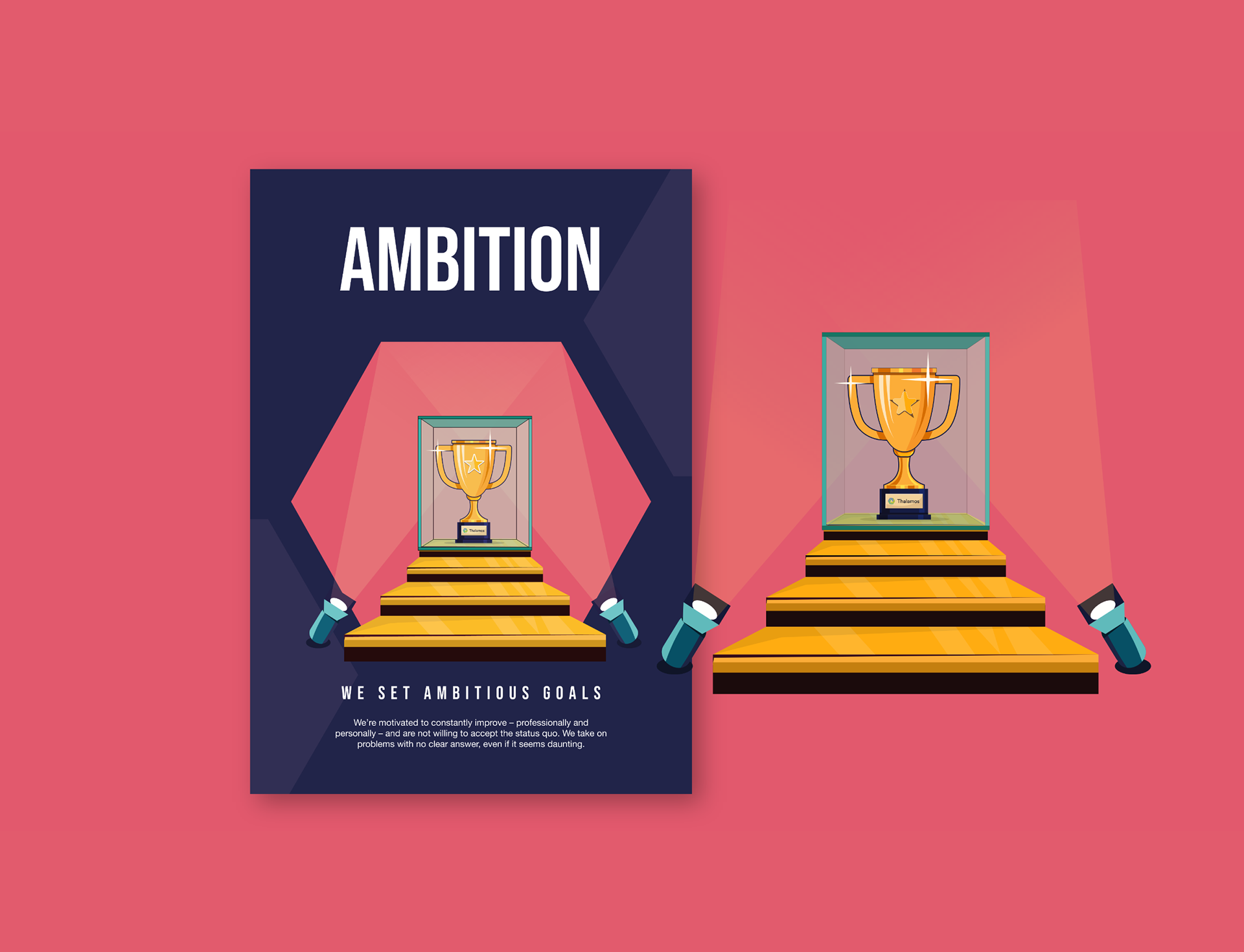
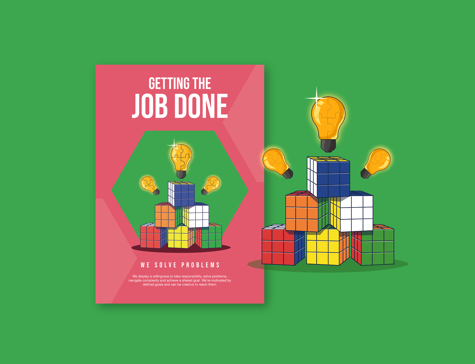
Thalamos: Brand Values Illustration Series
The Brief: Create a series of illustrations promoting Thalamos' company values. No colour restrictions, no style mandates, no safety nets.
I started by dissecting Thalamos' existing branding—not just logos and colours, but understanding the why behind their visual choices. What story were they already telling? What gaps existed between their values and visual language?
T H E E V O L U T I O N
Finding The Right Style
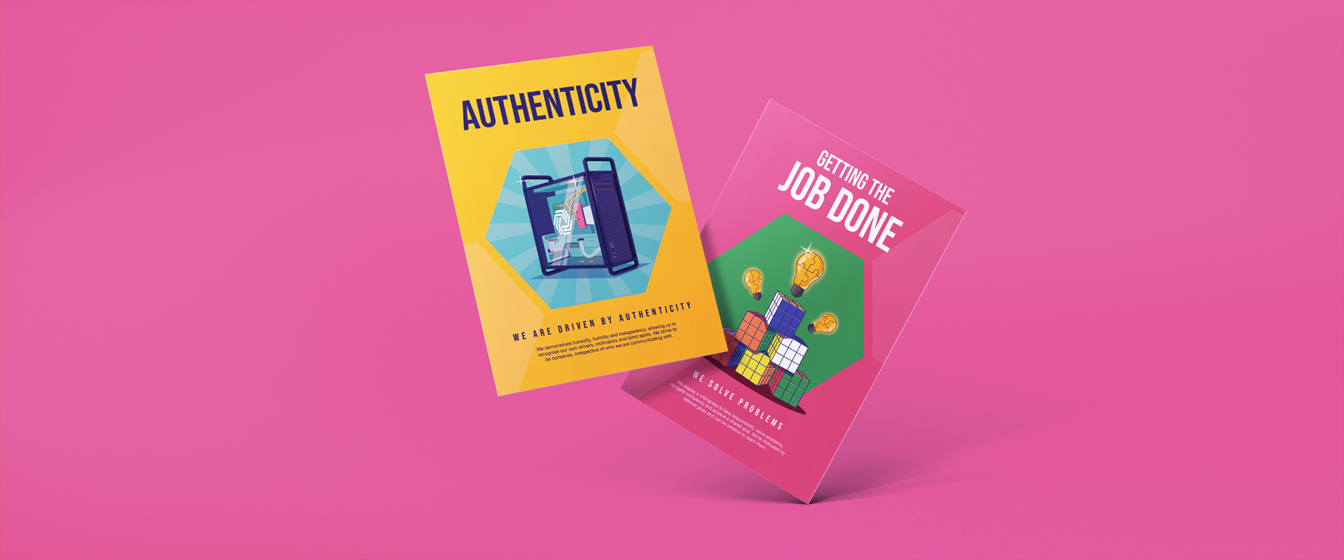
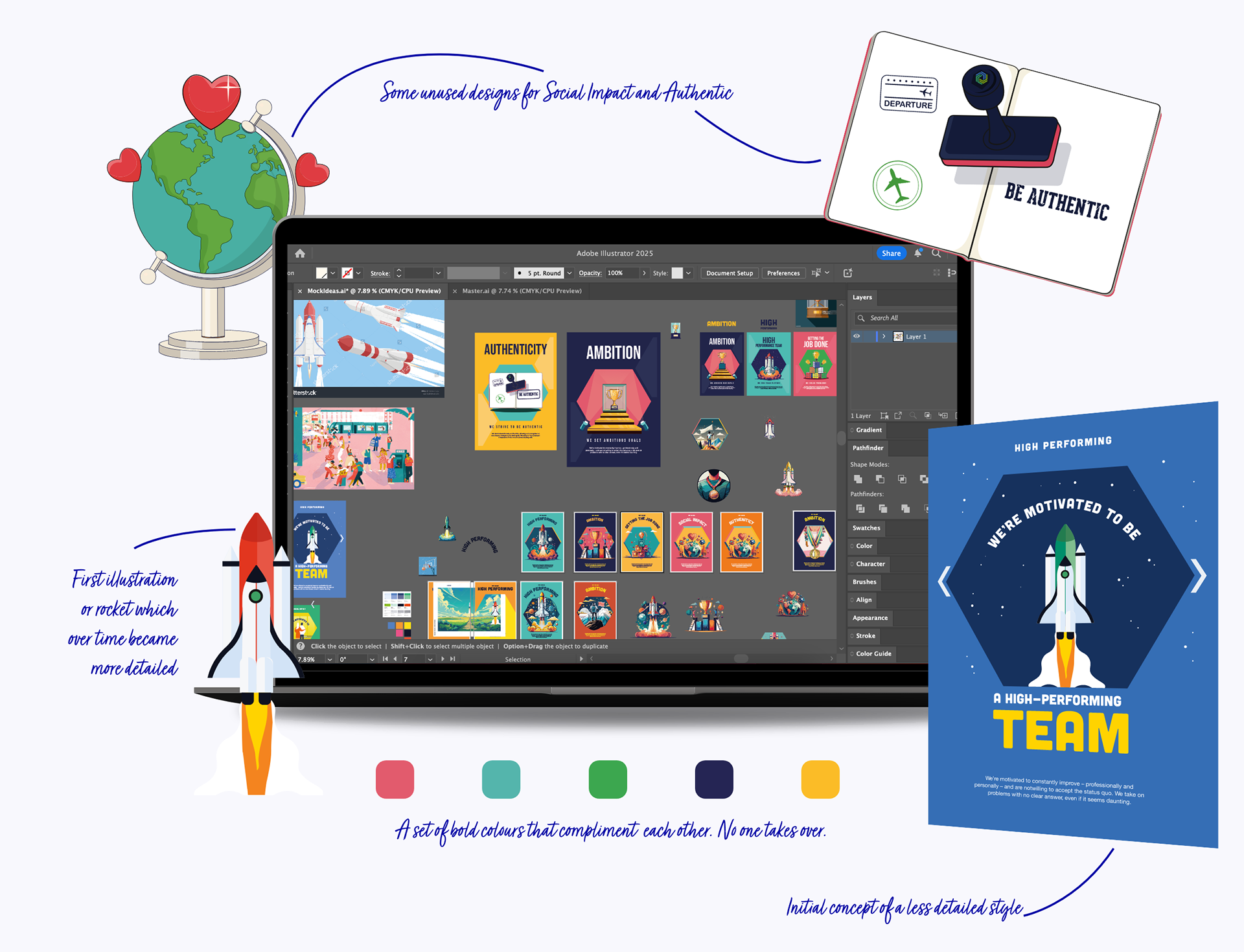
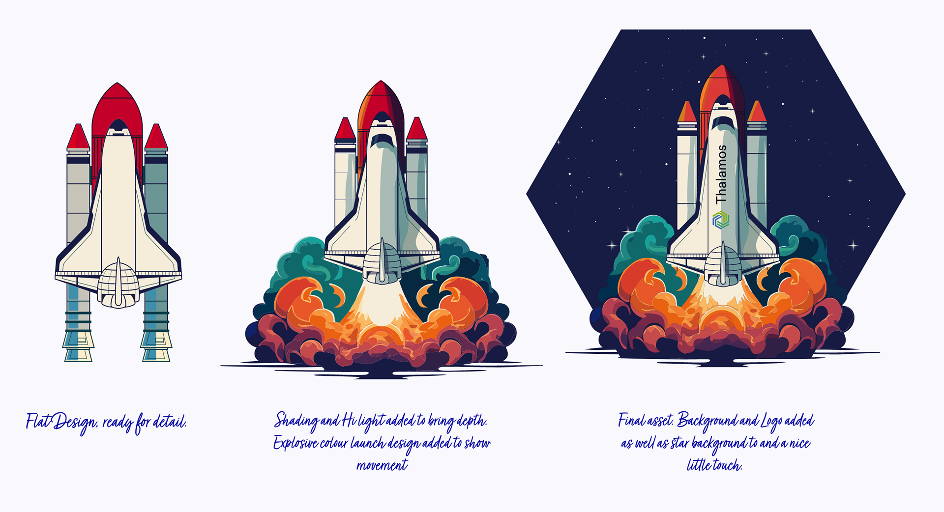
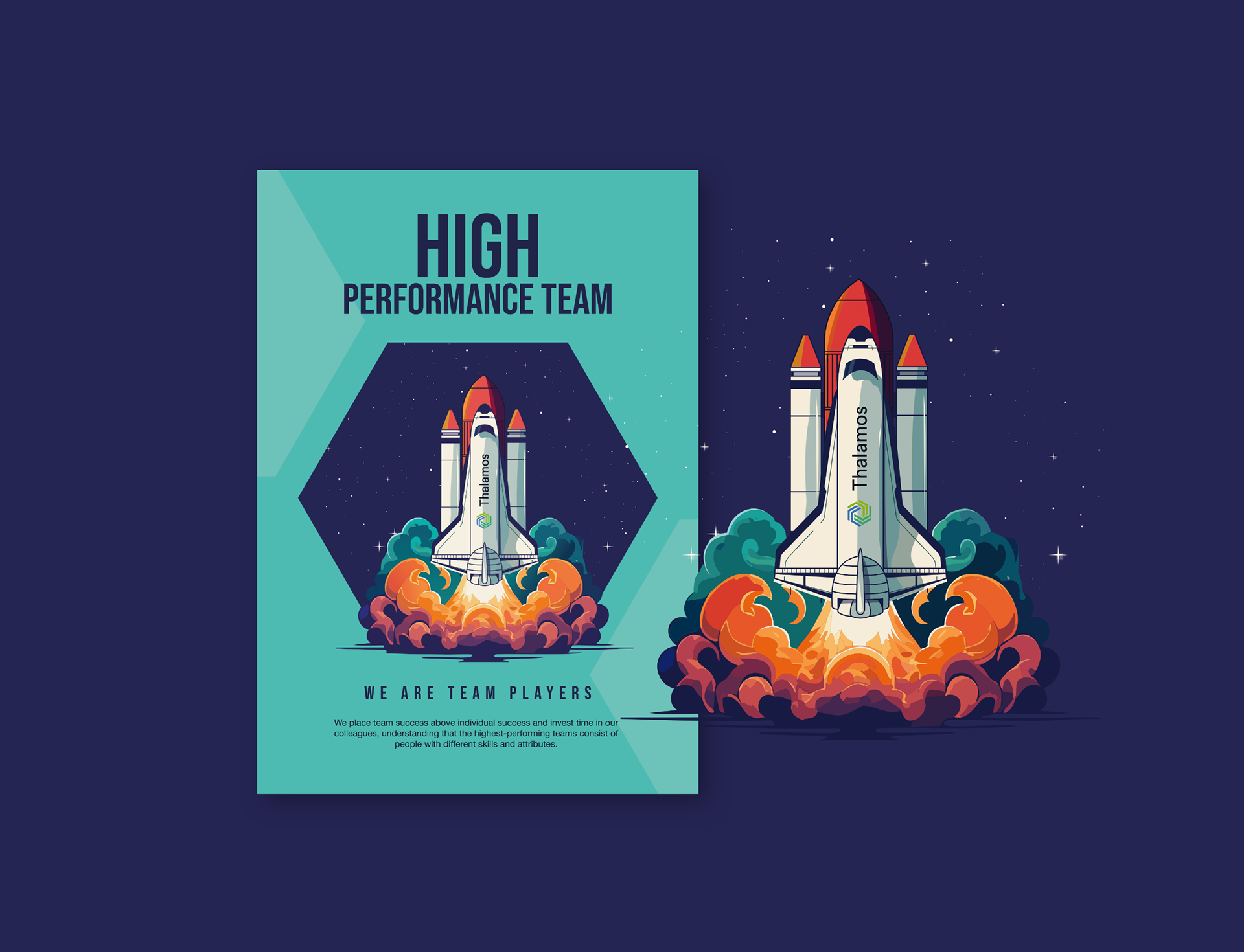
Initial explorations used flat vector style, clean but safe. The values deserved more energy and depth.
The Shift: Introduced shadows, highlights, and texture. Modern dimensional illustration that felt vibrant and engaging while staying clear and purposeful.
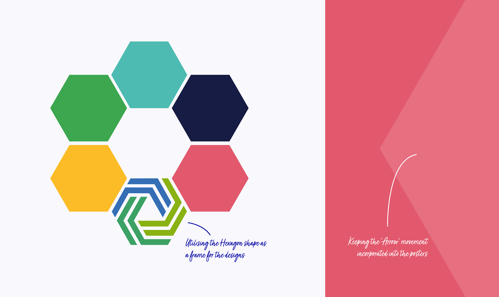
As the style evolved, I looked for ways to weave in brand elements. The hexagon from their logo became the perfect anchor, a consistent framing device connecting every piece.
T H E F R A M I N G
Hexagon System
The Thalamos hexagon became more than a frame—it tied designs and values into one cohesive story.
The System:
• Each illustration contained within the hexagon
• Works individually or as a series
• Tiled together, forms intentional patterns
• Faint hexagons at 20% opacity link visuals side-by-side
The Thinking: Subtle visual cues reflecting Thalamos' collaborative, joined-up approach.
The Driving Idea: Take the recognisable and reimagine it boldly.
Each illustration balances playfulness with substance, visually striking while honestly reflecting company values. Not just decoration, but visual stories that spark curiosity and make people stop scrolling.
T H E D E L I V E R Y
Print Ready Impact
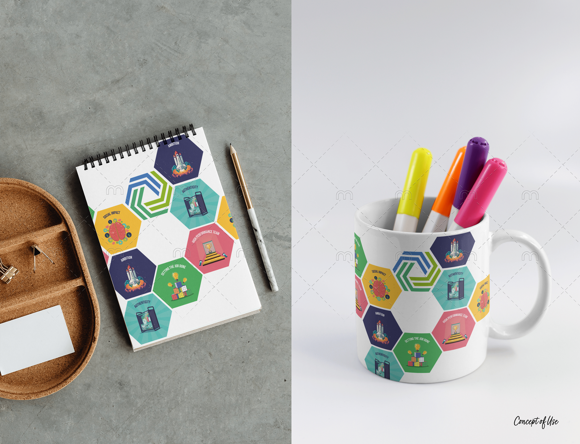
What I Created:
• Complete illustration series for company values
• Scalable hexagon framing system
• Print-ready poster designs
• Modular assets working independently or together
• Consistent visual language with built-in flexibility
The Result: A distinctive visual identity for Thalamos' values—bold, cohesive, and unmistakably theirs.
T H E I M P A C T
Creative Execution
Creative Execution:
• Dimensional illustration style elevating company values beyond corporate clichés
• Cohesive system working across print, digital, and environmental applications
• Memorable visual language creating engagement
Brand Integration:
• Logo element transformed into structural design system
• Visual consistency with individual character
• Framework supporting future value communications
The Outcome: Company values transformed from statements into compelling visual stories people remember.