Role: Lead Designer (Product, Brand & Web) | Timeline: Ongoing | Tools: Figma, Adobe Illustrator
T H E C H A L L E N G E
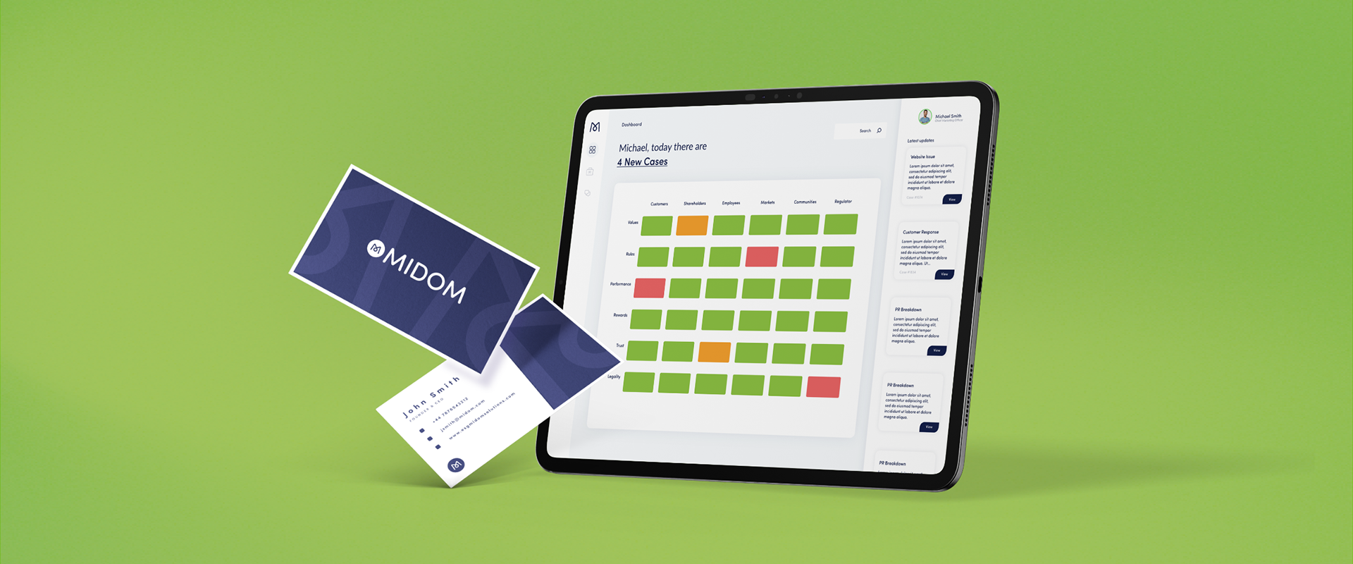
MIDOM: Enterprise Product & Brand Design
Design the complete product, brand, and website for MIDOM, an enterprise platform helping executives and boards manage risk and oversee business conduct.
The Stakes: Executives and boards need fast access to critical information buried in cases, documents, and timelines to make high-stakes decisions about business conduct. Get it wrong, and the platform loses credibility. Get it right, and you become indispensable.
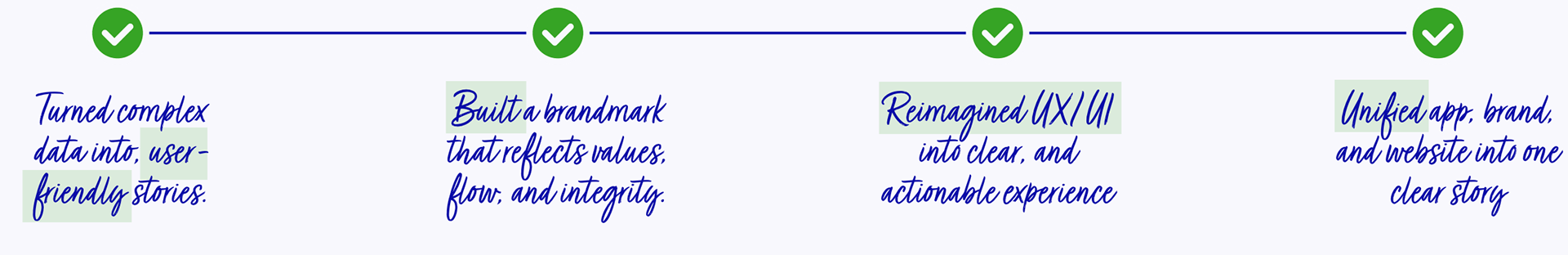
The Challenge: Turn overwhelming governance data into something decision-makers can actually use all in one platform.

T H E I N S I G H T S
The Research
I started by interviewing board members and compliance officers to understand how they currently process risk information and measure internal ESG metrics.
The insights were clear:
• The current process consists of multiple excels, email chains, reports. No central hub of information.
• Ownership is unclear and not easily traced
• Decision-makers scan, they don't read. Average time spent reviewing a case: 2.3 minutes
• Trust is built through clarity, not feature bloat
• Every second of confusion erodes confidence in the platform
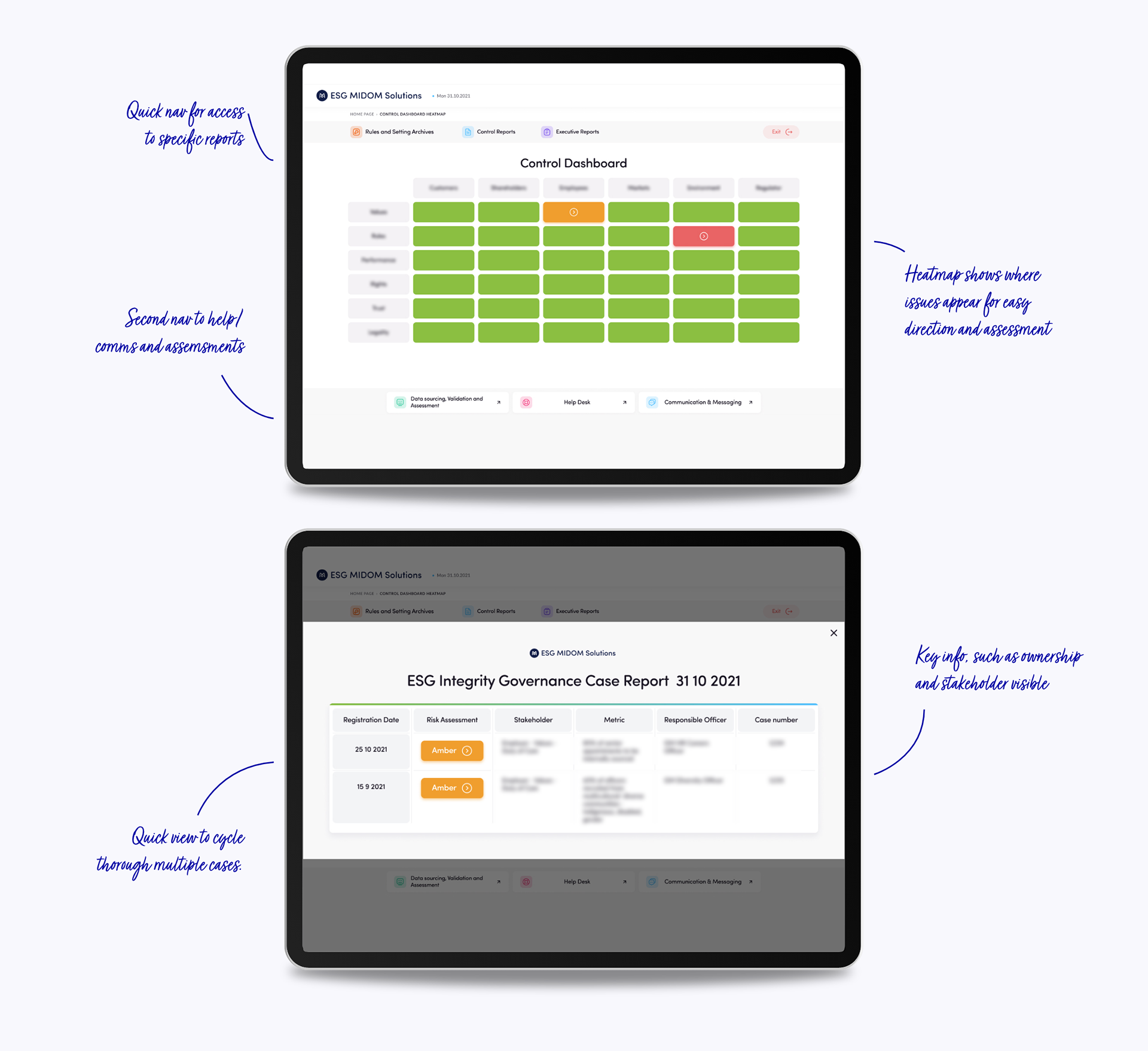
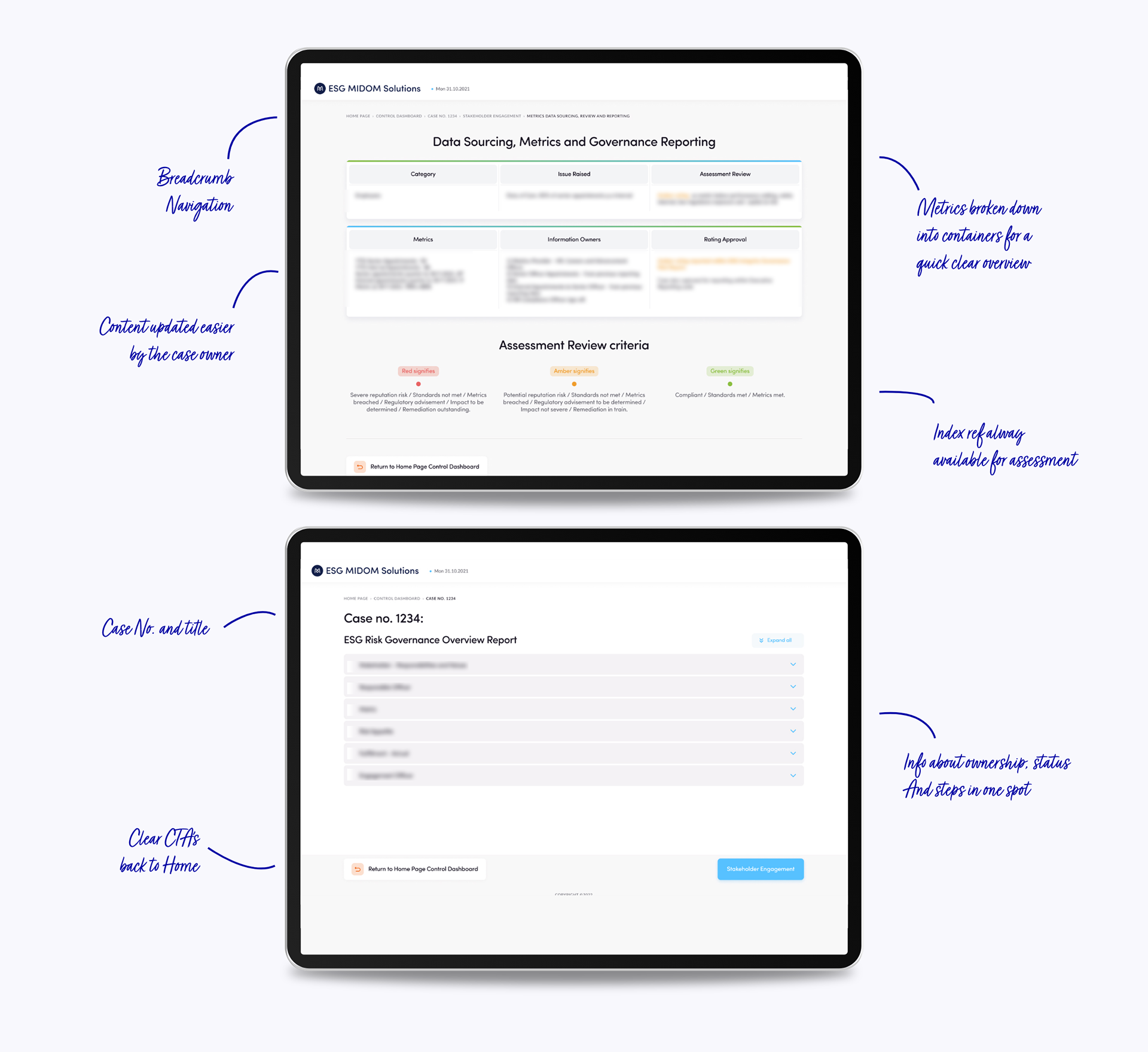
• They need to quickly answer: "What's the issue? Who owns it? What's the timeline? Where's the documentation?"
This research informed every design decision that followed.
S T R A T E G I C D E S I G N
The Product Strategy
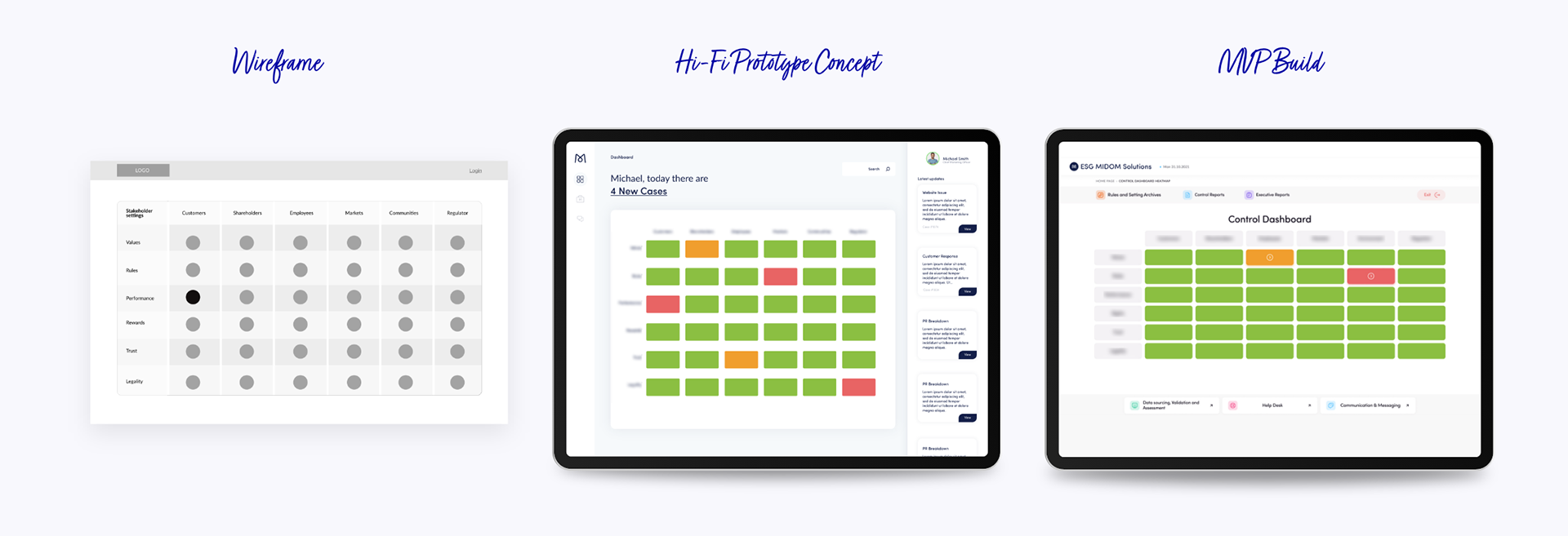
I designed the UI for each layout and worked with the development team in Sri Lanka to produce the hifi builds. Focusing on telling a concise story, optimising the user journey for fast decision-making and accessible insights.
The Approach:
Information Architecture: Key details front and center: case ownership, timeline, supporting documents, and resolution status. I used F-pattern layouts based on eye-tracking studies showing how executives scan content under time pressure.
Strategic Whitespace: Clean layouts with generous breathing room for fast scanning. In user testing, executives could identify critical case information 40% faster compared to dense, traditional compliance software layouts.
Strict Visual Hierarchy: Every element earned its place through multiple rounds of stakeholder testing. Removed 60% of the initial information fields—not because they weren't useful, but because they distracted from critical decision-making data.
Consistent Patterns: Built a modular component system across all case types. Once executives learned the pattern for one case type, they could navigate any case confidently. This consistency reduced training time and increased platform adoption.
The Philosophy: In governance, confusion erodes credibility. Visual hierarchy wasn't aesthetic—it was strategic. Clear design equals confident decisions.
M I D O M
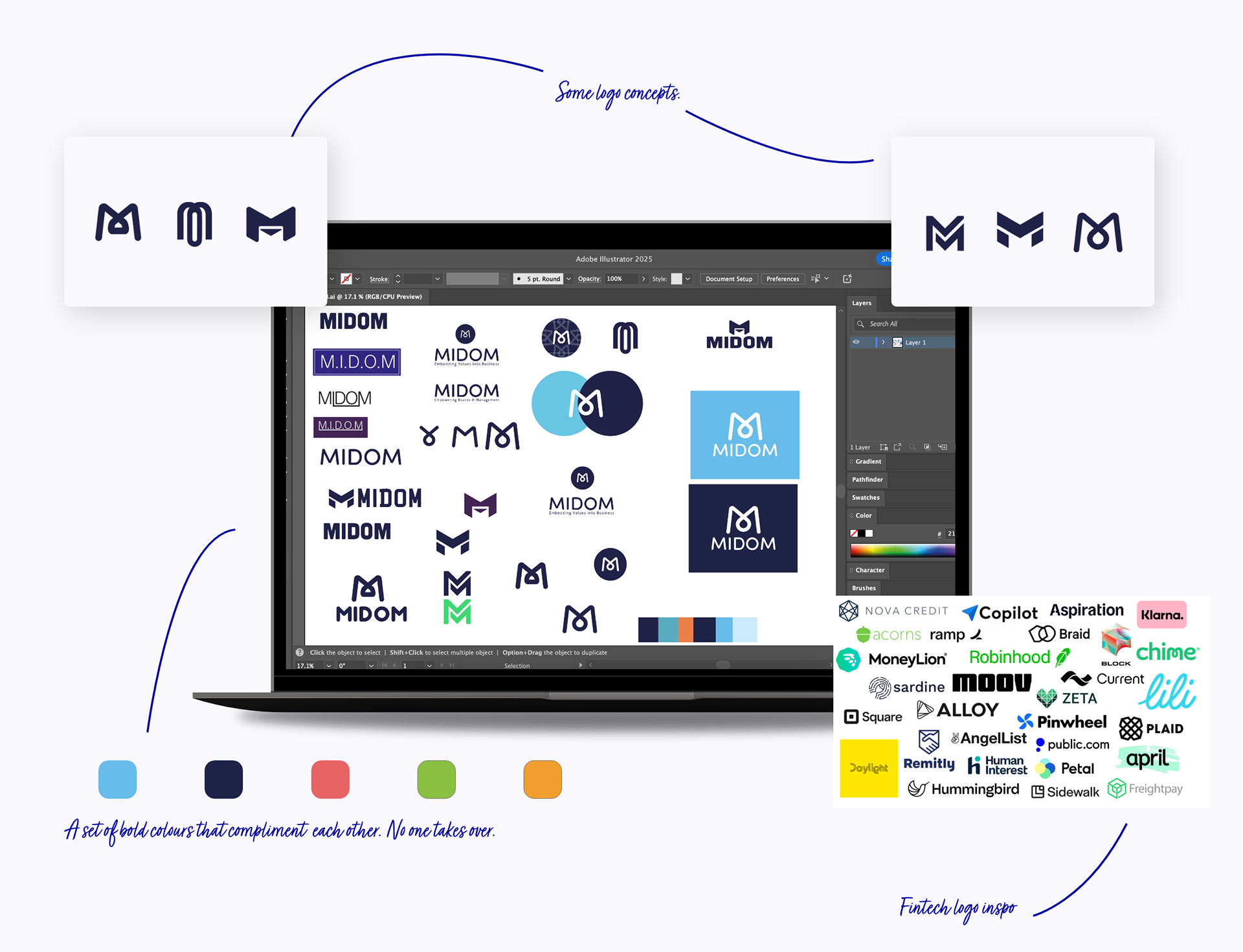
The Brand Identity
The "M" had to represent more than just the company name—it needed to communicate what MIDOM stands for: connection, flow, and trust.
The Evolution:
• Early Exploration: Initial concepts leaned into hard edges and arrows—too rigid and corporate. They communicated authority but not approachability. After presenting three directions to stakeholders, feedback confirmed these felt too disconnected from the collaborative nature of modern governance.
• The Insight: The real story wasn't about rigid oversight, it was about connection. The flow of people, values, and decisions working together across an organisation.
• The Solution: A looped, continuous M. Simple, but carrying meaning. The letterform flows seamlessly, representing the interconnected nature of governance and risk management. Flow over force. Connection over rigidity.
Colour Strategy:
• Deep Navy Blue (Primary Anchor): Trust and professionalism. This became the foundation—used for primary UI elements, headers, and critical information that demanded attention.
• Soft Off-White: Keeps visuals light and open, preventing the "heavy" feeling many enterprise platforms suffer from. In user testing, the lighter background reduced eye strain during long review sessions.
• Electric Blue (Strategic Energy): Reserved for CTAs and key touchpoints. Used sparingly to draw attention without overwhelming. This pop of energy differentiated MIDOM from competitors drowning in corporate blues and grays.
• The Discipline: Energy where it matters, never flashy. Every colour choice reinforced trust while maintaining modern sophistication.
Typography & System:
• Clean, modern sans-serif (Inter) for readability across all screen sizes
• Generous spacing echoing the open, flowing M
• Modular components that scale seamlessly from mobile to desktop
• Accessible contrast ratios meeting WCAG AA standards minimum (most elements exceeding AAA)
T H E M A T E R I A L S
The Brand Applications
The identity needed to work across digital products, marketing materials, and enterprise sales decks.
What I Created:
• Primary logo lockup (horizontal and stacked variations)
• Inverted versions for dark backgrounds
• Monochrome fallbacks for single-colour reproduction
• Pattern system using the flowing M shape
• Icon library for product UI
• Presentation templates for sales and investor decks
• Email signature system
• Complete brand guidelines with usage rules and examples
The Result: A cohesive system that maintains consistency whether viewed on a phone, projected in a boardroom, or printed on business cards.

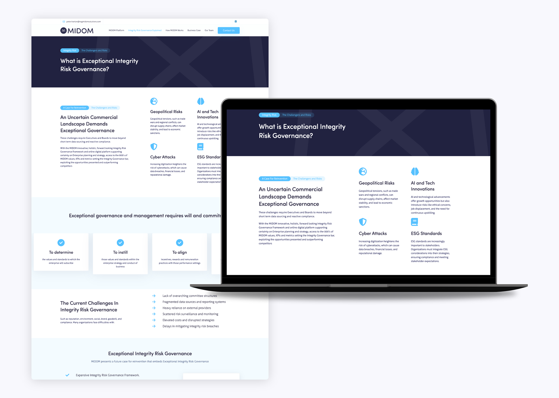
O N L I N E
The Website
The website had one primary job: establish immediate credibility with C-suite decision-makers who are researching governance solutions.
The Strategy:
• Trust Above the Fold:Unlike traditional SaaS sites that bury credibility, I placed key trust signals immediately visible: client logos, security certifications, and a clear value proposition. Executive audiences don't scroll without reason- you have 3 seconds to prove legitimacy.
Clear Information Flow
Structured content to answer the five critical questions enterprise buyers ask:
• What does this platform do? (Hero section)
• Why should I trust you? (Client logos, security badges)
• How does it work? (Product overview with progressive disclosure)
• Who else uses this? (Case studies and testimonials)
• How do I get started? (Clear, prominent CTAs throughout)
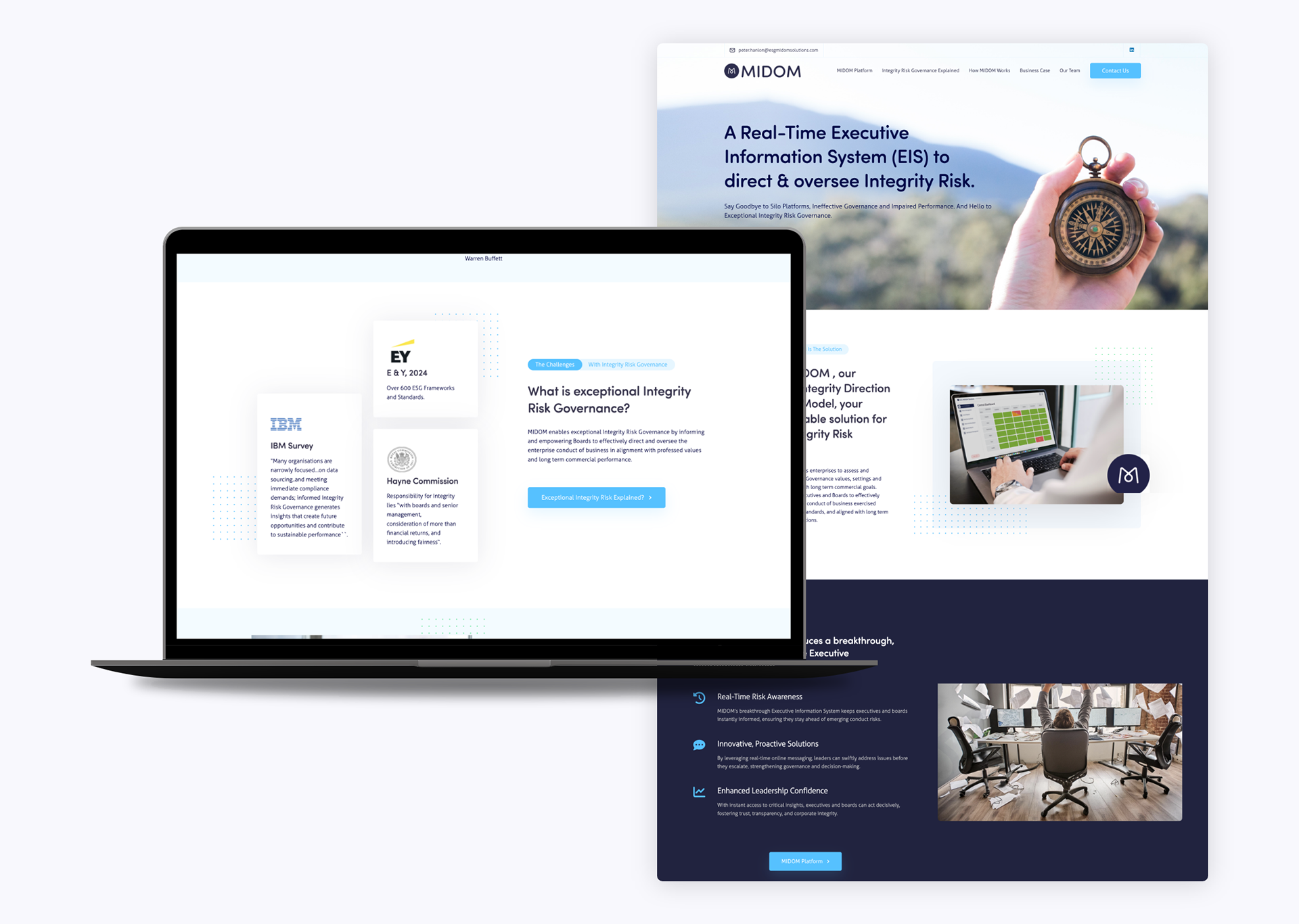
• Visual Consistency: The website uses the same design language as the product—same components, same patterns, same visual rhythm. This consistency builds subconscious trust: "The marketing matches the product."
• Subtle Motion: Added purposeful micro-interactions that echo the flowing brandmark. Hover states, section transitions, and scroll-triggered animations that feel premium without being distracting.
• Mobile-First Responsive: With 40% of initial research happening on mobile devices (often during commutes or between meetings), the mobile experience had to be flawless. Every section was designed mobile-first, then enhanced for desktop.
T H E I M P A C T
The Results
What I delivered:
• Complete product UX/UI (case management, dashboards, workflows)
• Full brand identity (logo, colour, typography, guidelines)
• Responsive website design and content strategy
• Design system connecting all three touchpoints
The Result: Every design decision—from the flowing M to clean data cards to the trustworthy colour palette—worked together to create something both serious and approachable.
MIDOM didn't just get a new look; it got a new way of connecting with the people who need it most.