C R E A T I V E S O L U T I O N
Championing Artists
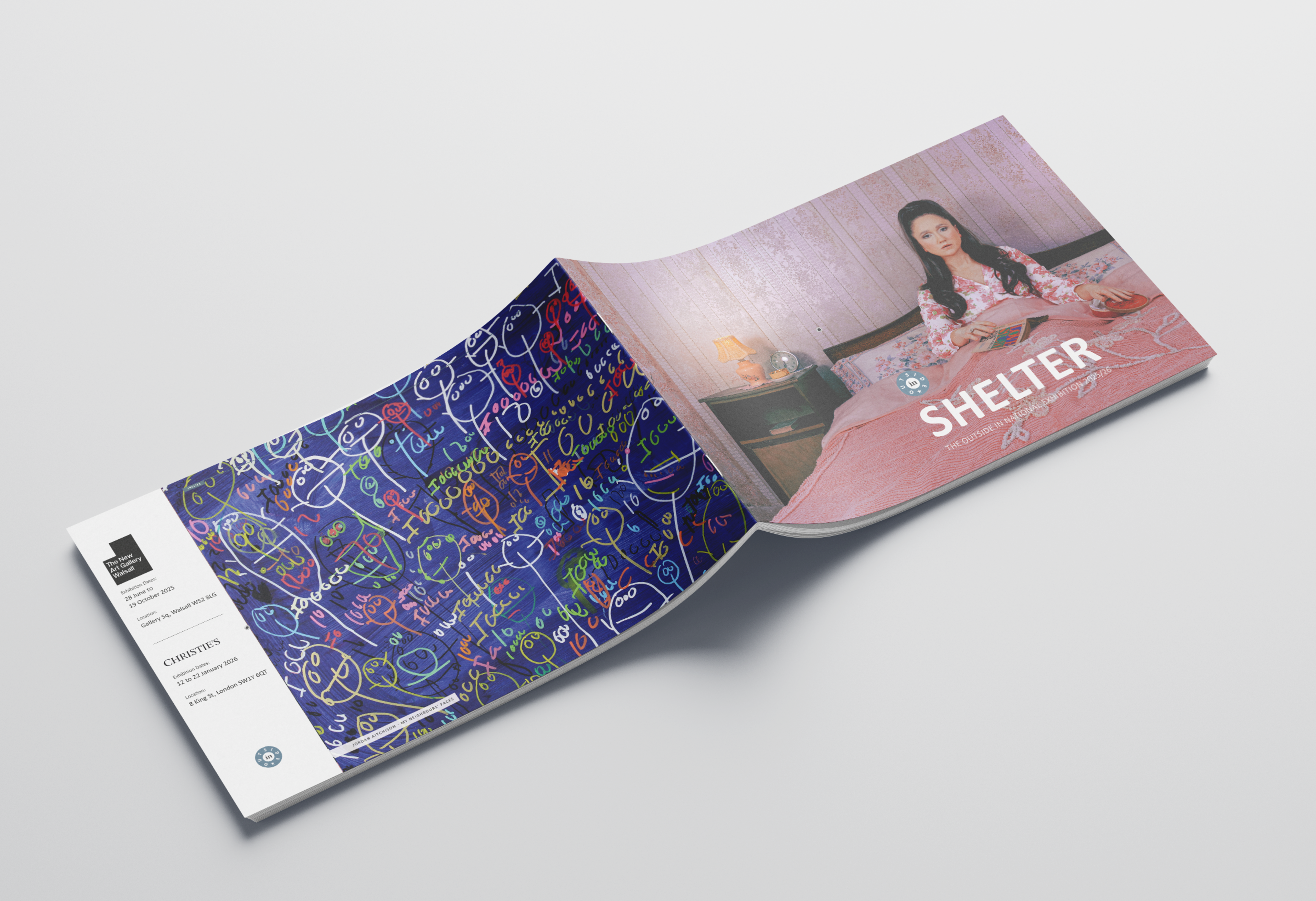
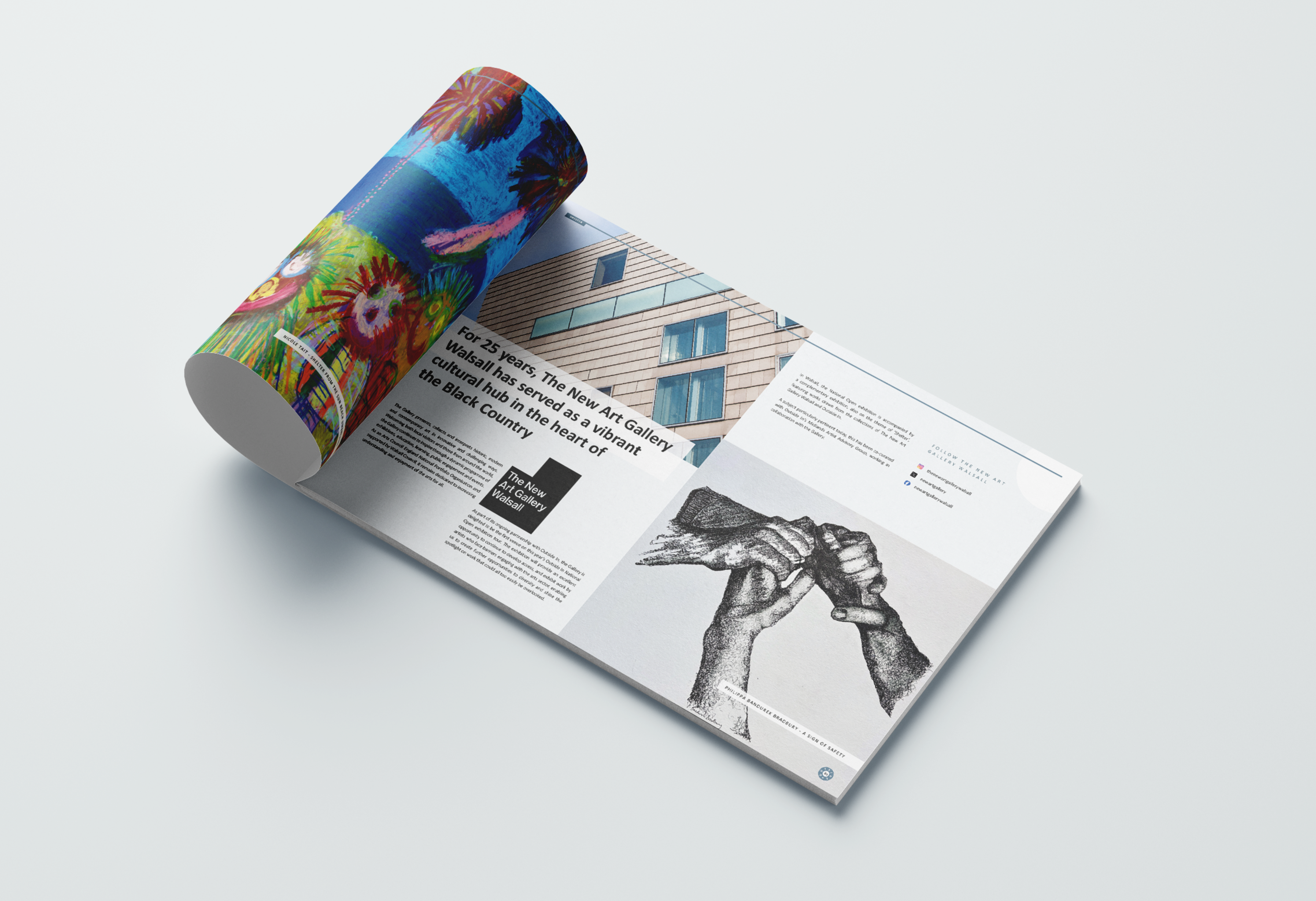
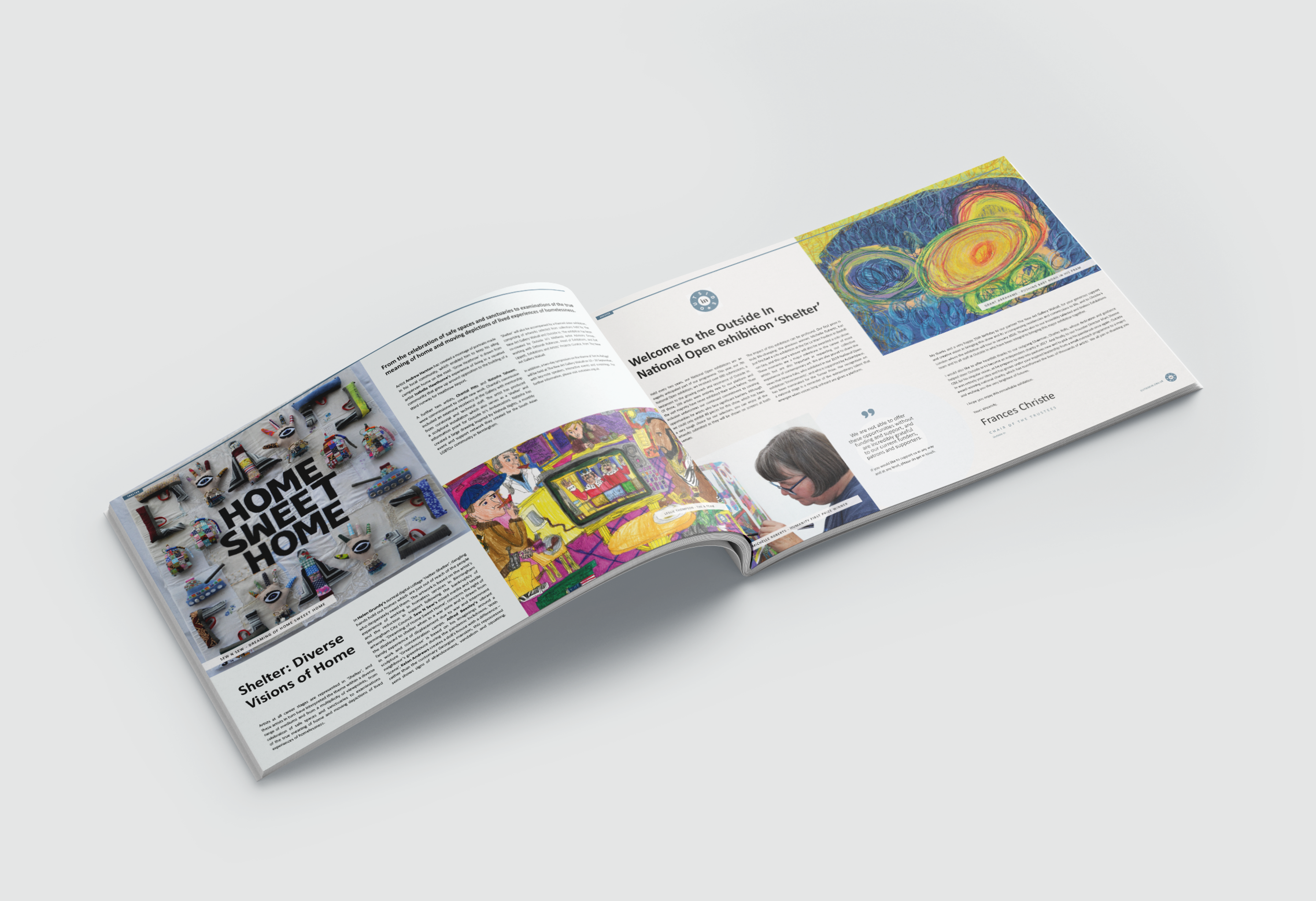
Working with Outside In was one of those projects that reminded me why I love design. The organisation exists to give a platform to artists who face barriers to the art world because of health, disability, social circumstance, or isolation. Every year, 80 artists are chosen from across the UK for a major exhibition, and this year’s journey began in Walsall before moving on to Sotheby’s in London.
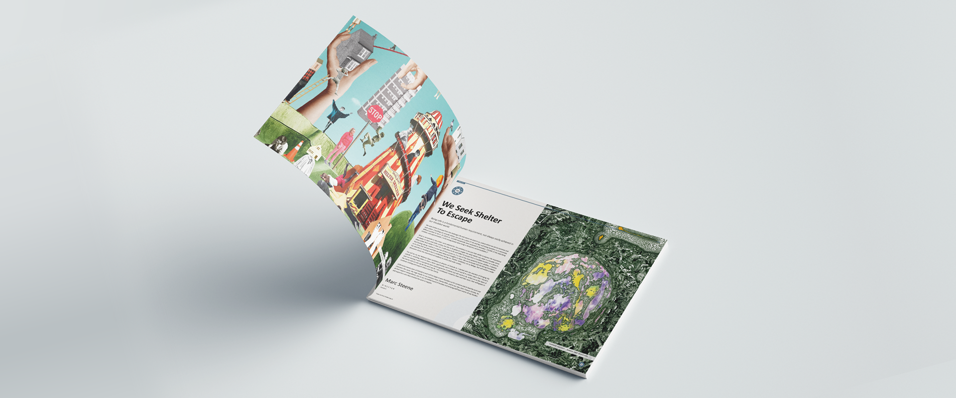
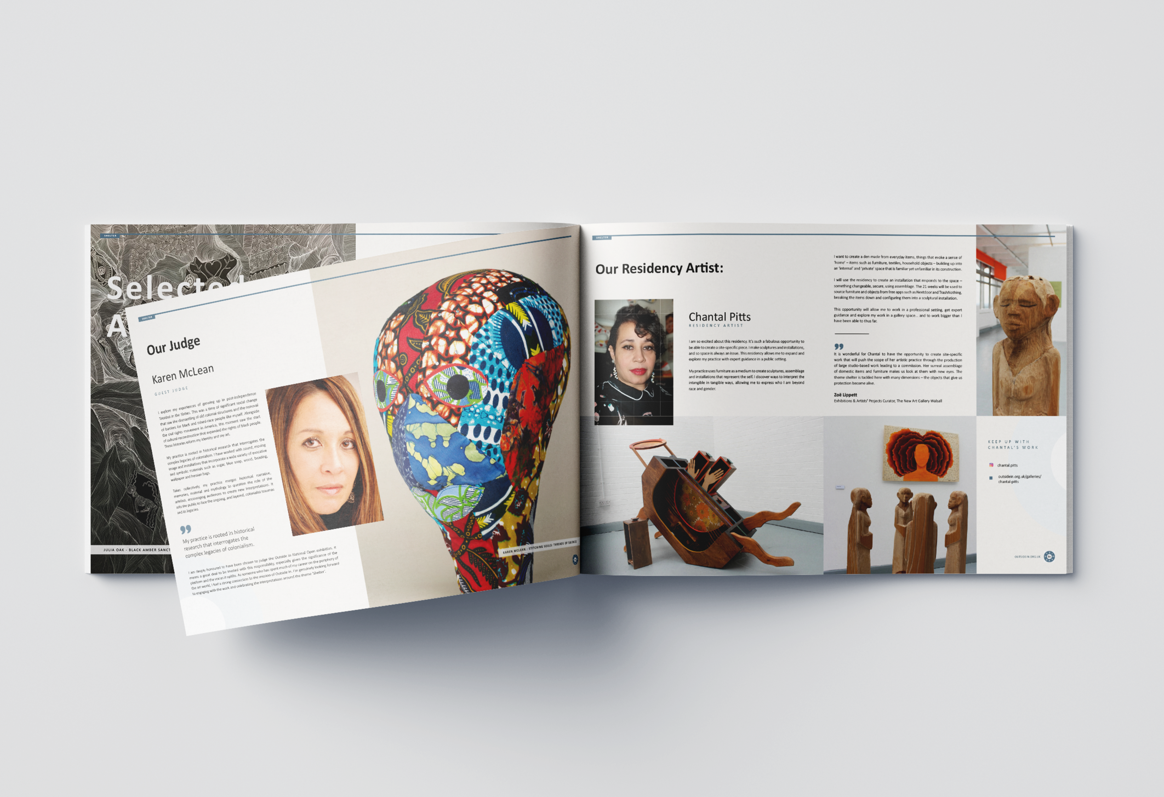
My role was to create the exhibition brochure — a piece that had to carry a lot of weight. It needed to introduce the mission, the supporters, the selectors and judges, and most importantly, celebrate each of the 80 artists. I knew immediately that this couldn’t just be an informational booklet. It had to feel like part of the exhibition itself: a space where the artists’ work could live and be experienced.
F O C U S O N T H E A R T I S T
Accessible & Uplifting
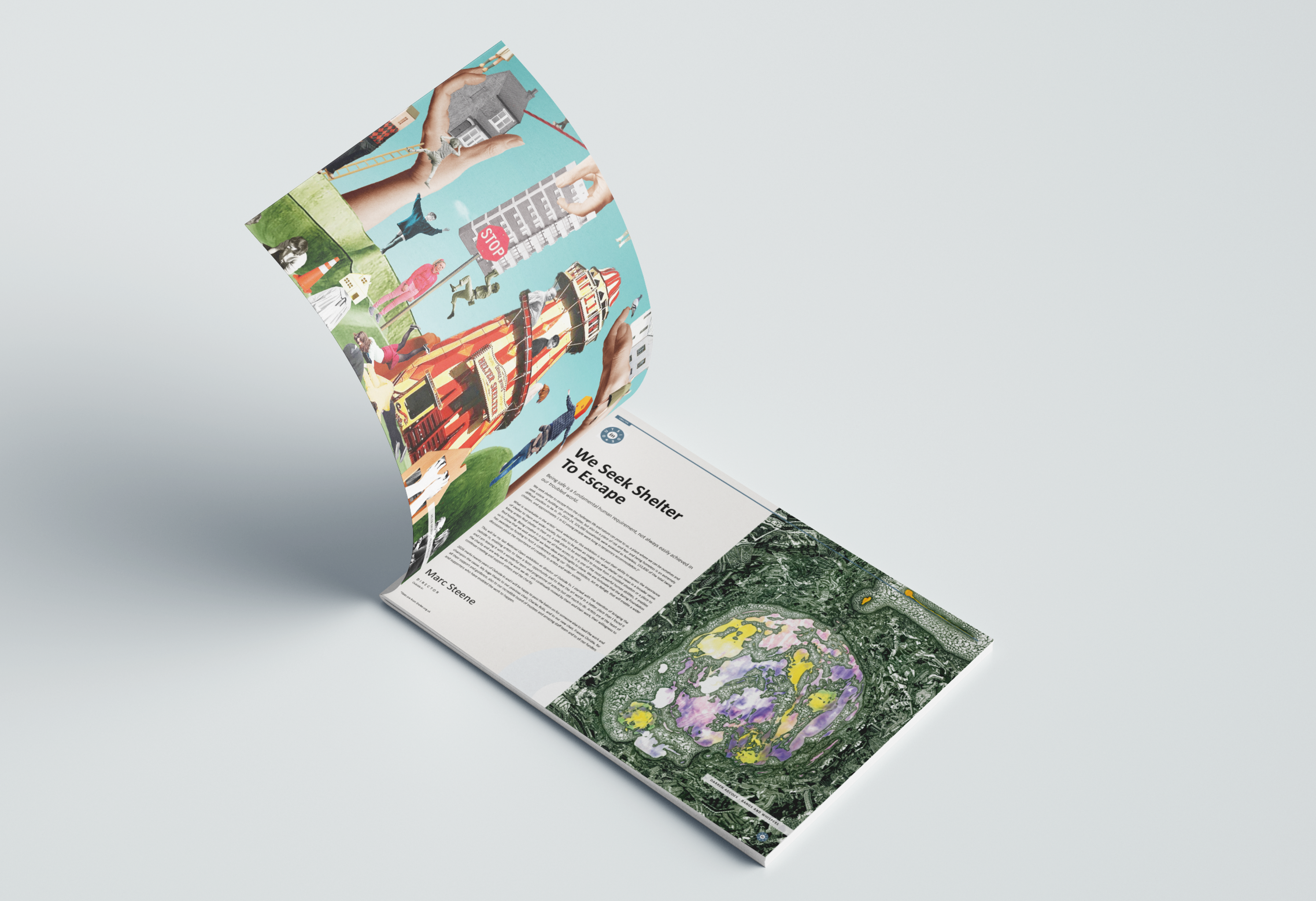
From the start, I knew the artwork had to lead. Images were given room to breathe, full-page spreads, bold placement, and clean white space that let colour and texture shine. Text supported rather than competed, flowing naturally around the visuals.
The result felt less like a brochure and more like a celebration in print. Sleek but warm, playful but clear. Most importantly, it captured the spirit of Outside In: uplifting, accessible, and artist-focused.